HTML (HyperText Markup Language), the first ever standard to emerge from the W3C, is widely used on the Web. It is by far the most common tool for designing Web pages, which is why people usually refer to HTML as the backbone of the WWW. Thanks to HTML structuring elements (tags), text documents interpreted by browsers can display their contents according to specified formats. HTML is one of the main reasons why the Web has become so popular over the years.
XML (eXtensible Markup Language) is like HTML on steroids. While it supports most of the fixed set of elements contained in HMTL 4.0, it allows the coder to customize new tag elements according either to a pre-set DTD (Document Type Definition) or to one that can be personally defined. XML is much more flexible than HMTL and is totally future-oriented. XML is the standard through which the Web’s full potential can be achieved.
CSS (Cascading Style Sheets) are a Web developer’s dreams come true. It is a mechanism through which changes in appearance and position can be assigned to HTML or XML elements, simply by declaring specific styles to them. The overall appearance of entire sites can be so defined with the use of CSS, allowing it to be remodeled in a matter of seconds. This Standard was brought forward by the W3C to create a simpler and more structured World Wide Web.
DOM (Document Object Model) allows a scripting language to exert its full power and interactive capabilities on a Web page. It’s a platform- and language-neutral interface that allows programs and scripts to dynamically access and update the content, structure and style of Web documents. They can be further processed, and that processing result can then be incorporated back into the Web page by the browser. The use of DOM as a standard will simplify DHTML coding, and will be fully compatible with upcoming technology improvements.
ECMAScript (the standardized version of JavaScript) is a client-side, object-oriented scripting language based on several technologies such as Netscape’s JavaScript and Microsoft’s Jscript. The main use of ECMAScript is to manipulate objects in a Web document that are specified by the DOM. Through it, elements can be manipulated, moved, or have some properties changed, allowing Web developers to implement such effects as animated text and graphic rollovers. The current specification is in its third edition, as ECMA-262.
Norms and models for web page layouts
Web Standards are a specification for Web Designers and Developers to follow which ensures that the websites they build are usable and accessible to all, regardless of the device they use to access the Internet. The Standards specification covers over 90 topics such as Web Design Applications, Web Architecture, and Web Semantics.
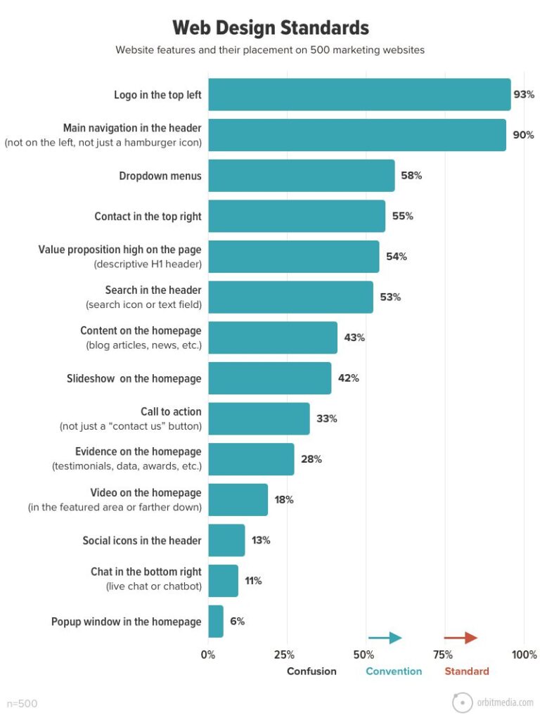
Which features are standard on websites?
Standard: 80% or more of websites use the same design approach
Convention: 50–79% of websites use the same design approach
Confusion: 49% or fewer websites conform, no single design approach dominates
Why are They Important?
Increase Search Engine Rankings
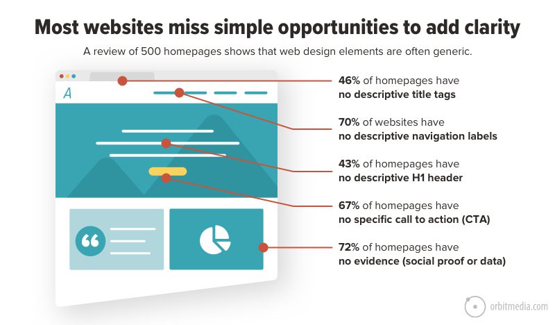
Building a website using semantically correct HTML will allow the site to appear higher in search results. Following Web Standards when building websites ensures that the code created will be indexed more accurately by search engine bots.
CSS class names on HTML elements can also go a long way to informing search engines what the content of that element will most likely be. It is therefore important to use descriptive class names which describe the content, rather than defining the styling that is applied to the element.
Standard website width 202
We can divide up the widths of various devices between 4 categories of desktop, laptop, tablet and mobile. I will put the standard sizes for these below as a rough guide to you to determine a standard width:
Desktop: Above 1440px
Laptop: 992px to 1440px
Tablet: 576px to 992px
Mobile: Up to 576px
Now of course with the plethora of devices that come in all shapes and sizes, this is an approximate guide, and my best advice when building responsive websites for mobile and deciding on ‘breakpoints’, is that breakpoints should kick in once the webpage design is broken as opposed to using the standard widths of devices. You may find your design breaks at 994px, so then that is where your breakpoint for mobile or tablet responsiveness should be regardless of where that falls according to device widths.
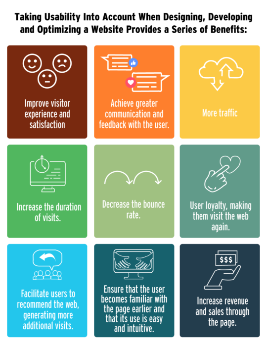
Web Usability: What is it and Why is it Important
“ Web usability is the degree of ease of use that a web page has for visitors who enter and interact with it. A website with good usability is one that allows users a simple, intuitive, pleasant and safe interaction.” – Jakob Nielsen, 2012.
Source: BGH. Web usability.
Source: BGH. Optimization principles of the visible language.