Newby tea

UX/UI Design Process

Web Design/ UI/UX Design for an E-Commerce Startup

UI/UX Designer, Brand Consultant Role Adobe XD, After Effects, Photoshop, InVision,

2 months Tools Timeline

Business goals:

  • Promote the brand
  • Reach new customers

Target market:

  • Aged 20-40 who live in the UK

MY ROLE

Sole designer, UX/UI design

LANGUAGE:

Italian – Hindi-  English

1

BACKGROUND

BACKGROUND

I felt so excited about this project! Why? Not just because I’m a huge tea lover, it is because I had to design an online tea store!

Because of the pandemic situation, many tea shops closed down in the UK. The founder of Newby thought that it is time for them to bring positive vibes to society, by holding experiential tea workshops and promoting quality, especially tea to the tea lovers in town. This is the reason why she founded Lab Aura in August 2020.

Currently, the sales channels are Facebook and Instagram. The sales are good and she got an interview from a magazine on Fashion. I am setting up a website for more exposure and branding purposes.

Key objectives of the website:
  • Branding
  • Communicate experience and services
  • Generate sales leads for the courses and products
  • Share the Fashion knowledge & experiences with others


2

STARTING FROM SCRATCH

Before the research, I felt the need to understand more about the brand, like the brand personality, the mission, target market etc. So I had a meeting with the client to discuss this in-depth. However, the client mentioned that this is still a raw idea so she needs some help on refining the brand as well.

So I had a quick brainstorming session with the client to get a clearer idea of the core values, mission/vision and the brand personality. I asked quite a few questions just to guide her to think more about the direction and how we should represent the brand. It was a fruitful session and I enjoyed it very much!

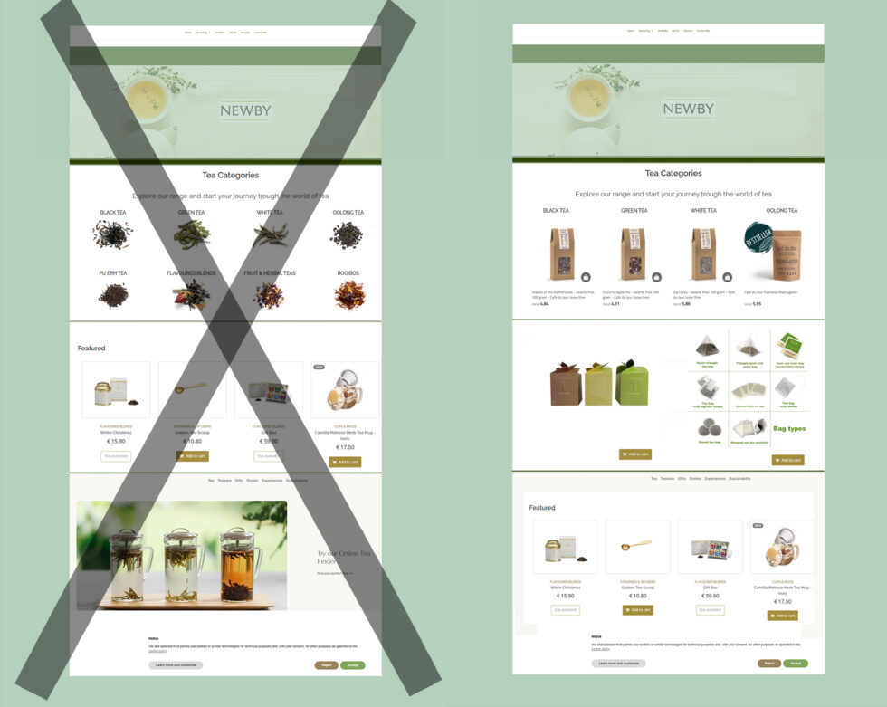
After the meeting, I’ve worked out a few options of brand color based on the client’s idea.

3

THE CHALLENGES

The Challenges
  1. Small team with only me and the founder. So I will be the one who does project management as well.
  2. The client does not want a pure E-commerce site. The site will also be a platform for her to share her knowledge and experiences with tea lovers.
Project Goals
  1. Complete the project within 2 months
  2. Do a competitive analysis of the big players in the market
  3. Create the brand guidelines
  4. Discover an interaction platform for tea knowledge sharing
Key Features:
  1. Automate business process (currently the client has to manually update the customer orders)
  2. Content Management System for products, events, and blog
  3. Online store  payment and shipping calculation tools
  4. Allow customers to subscribe for updates

4

COMPETITOR ANALYSIS

The client has identified 4 of her key rivals in the UK. Below is the analysis of their websites:

5

USER RESERCH

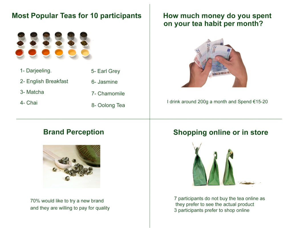
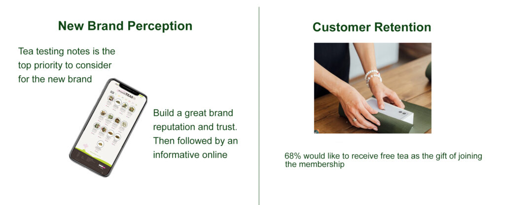
The next step is to conduct user research by survey and interviews.
Objectives:
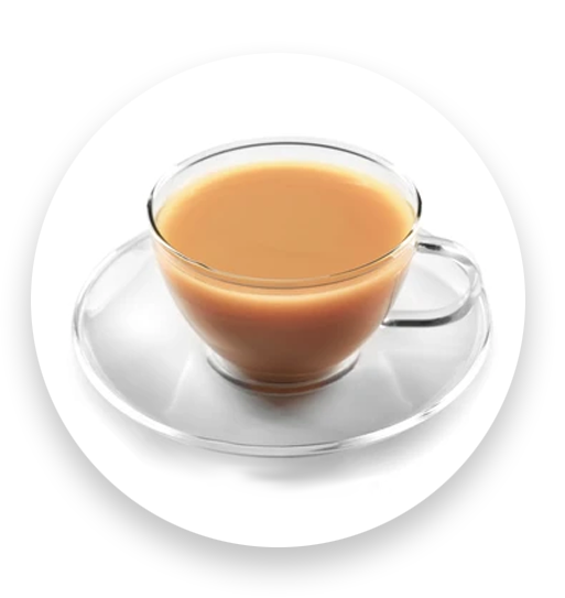
- Understand users’ habit of drinking tea. Where do they buy tea leaves and why? - Their motivations for purchasing tea -related products online


A. Survey - 24 participants

The survey is divided into 3 parts: the habit of drinking tea, buying specialty loose leaf tea, and whether they want to attend courses to gain more knowledge


B. Interview with consumers - 5 participants

I have interviewed with some of the participants to get an in-depth understanding of their opinion on tea and their buying behavior/decision criteria when choosing a tea brand.  Followed by a few questions to find out what induce them to learn more about tea, and what makes them applying for tea related courses or workshops.

From these conversations, I’ve obtained more information for the user persona of the project:

6

IDEATION

IDEATION

Ideation

With the results of the user research, we have a more substantial idea of the users. I have created a site map and user flow to support my design strategy.

A. Site Map

I’ve drafted the distribution of the website pages and sent them to my client for review:

The client has reviewed the site map and there are a few minor changes:

  • Tea Gear and Gift Box have to be taken out as she decided to sell loose leaf tea  only at the moment
  • Member section is not needed
  • Events will be grouped under the “About” section


B. User Flow

This shows the steps that need to be taken for Eugenia to purchase loose leaf tea from the website.


C. the wireframes (Landing page and anout page)

I’ve decided to design the landing page and company information page to present to the client first. Its style had to define the stylistic direction for the rest of the pages. This enables me to get feedback from clients and iterate quickly.

UI Concept:
  • Minimalistic and focused
  • Simple and clear micro-interactions
Design strategies:
  • A Hero image with a tagline to emphasize the USP of the brand
  • Press section will be presented on the landing page as from the result of the user research, users feel more confident in making their purchase from a reputable brand
  • Increase the attractiveness by having the scroll animation on the landing page (so users can see loose leaf tea and brewing when they scroll down). While on the company page, I’ve added a section where users can click to see the fun facts about the founder.

7

MID - FIDELITY PROTOTYPE

More challenges ahead

After discussing with the client, she is fine with the look and feel of the design. There are a few changes that need to be made:

In the product section – she prefers having different background colors to reflect the tasting notes of the tea beans. So I will go back and amend that.

Navigation bar – courses/workshop is too long and will be replaced by classes. I asked the client if we could just put the brand name instead of the logo as the marble background may look odd. It is still to be confirmed so I will keep it as it is as of now.

More challenges were identified during the meeting:

–  No resources for marketing so even after the customers subscribe to her website, she has no time to create an e-newsletter for promotional purposes.

– The client does not have the budget to set up a store on Shopify or other similar e-commerce platforms and she does not prefer using WordPress and Wix.

– To narrow down the scope, I asked how many products she intends to sell per month and whether a shopping cart on the site is needed. It turned out that there will be less than 5 products and she is fine with the site without a payment gateway/shipping calculation tool on the site.

Solutions:

– Take out the subscription button at the moment until she has marketing resources.

– Use Webflow as the publishing platform which allows more flexibility in design.

– Create an online order form. Credit card payments will be added later when there are growing requests.

  • Take out the subscription button at the moment until she has marketing resources.
  • Use Webflow as the publishing platform which allows more flexibility in design.
  • Create an online order form. Credit card payments will be added later when there are growing requests.

8

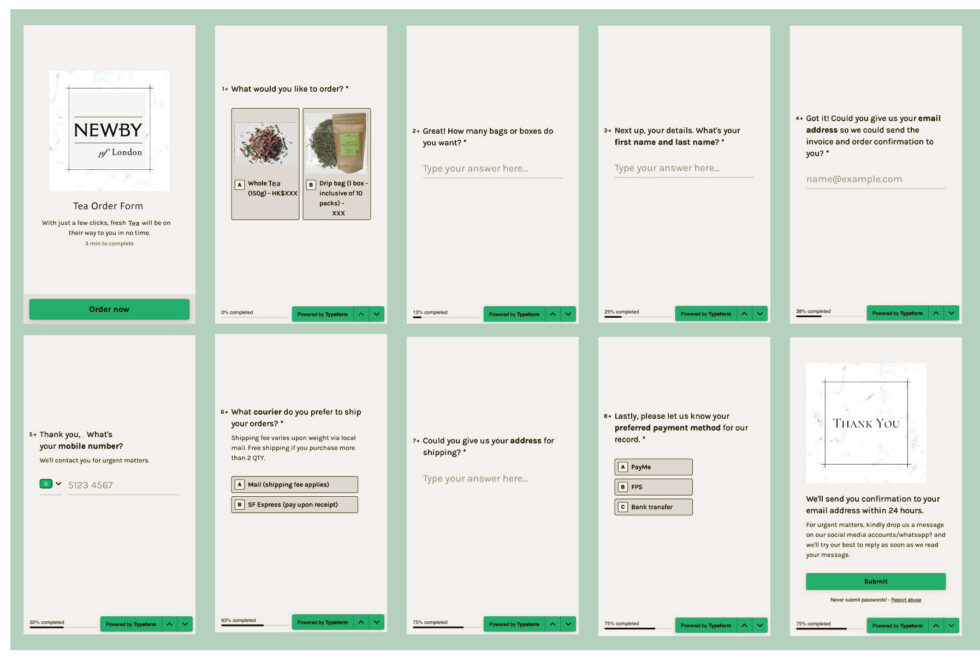
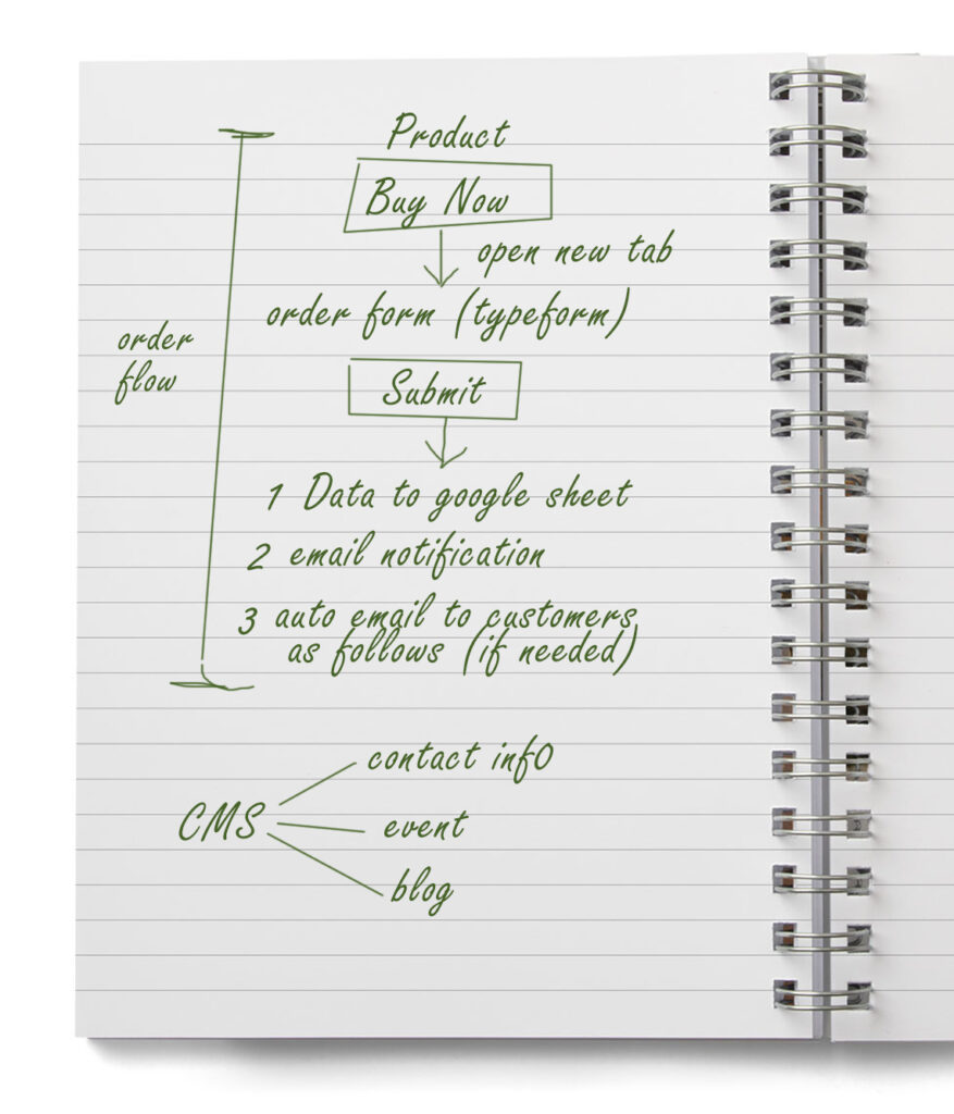
I went back and did some research on the online order form. Google form was one of the choices, but it is not very interactive. Then I found Type form which acts as a live user agent and guide the customers throughout the ordering process. The conversational form creates a better experience for users while still able to customize the form to match the brand identity. It can integrate with google sheet so there will be a centralized order database for a client to process.

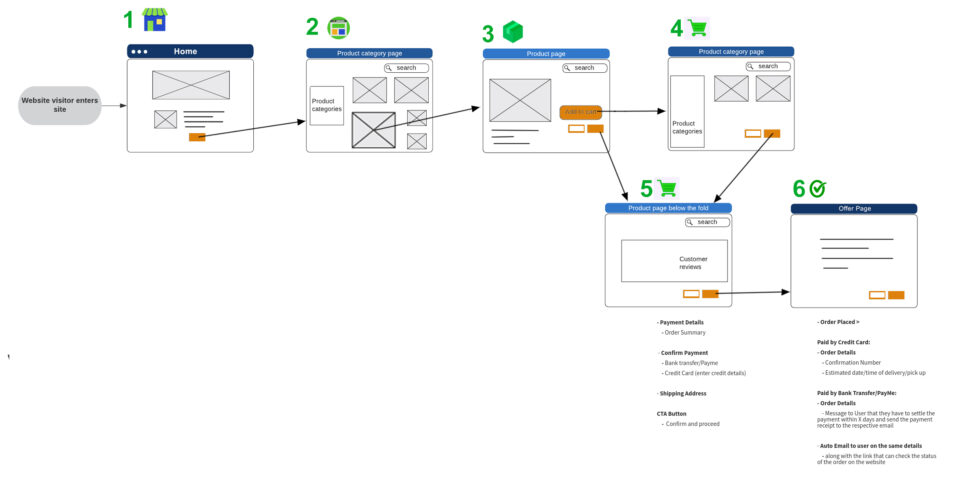
So I drafted the revised order flow and the content to be created in the CMS, together with the drafted online form and jumped on the call with the client for her approval.

THE REVISION

9

THE DESIGN

The Design

Per the client’s request, the overall look is minimal and elegant which matches the brand personality.

Use Motion Design to Create Movement

Since there are a few sections on the landing page, I thought the user experience would be enhanced if I add some animations to tell stories and guide the users to scroll through the different sections.

The Concept:

  • Farm to cup tea journey (loose leaf tea – Tea Powder –  a cup of tea)
  • Each animation relates to the section. For example, the tea brewing animation being placed before the “Classes” section, serves as an introduction to tea brewing classes.

The client likes the concept so I created the vector arts and use After Effects for animation. Then convert them to files by the Bodymovin plugin.

Here is what it looks like:

Product Images

  • A Gradient background with a white spotlight to add more depth and it also matches the brand associated with light.
  • Added tea leaves to the main product background.
  • For the drip bag tea box set, I’ve designed a frosted glass background.

Per the client’s request, the overall look is minimal and elegant which matches the brand personality.

Use Motion Design to Create Movement

Since there are a few sections on the landing page, I thought the user experience would be enhanced if I add some animations to tell stories and guide the users to scroll through the different sections.

The Concept:

  • Farm to cup tea journey (loose leaf tea – Tea Powder –  a cup of tea)
  • Each animation relates to the section. For example, the tea brewing animation being placed before the “Classes” section, serves as an introduction to tea brewing classes.

The client likes the concept so I created the vector arts and use After Effects for animation. Then convert them to Lottie files by the Body movin plugin.

Here is how it looks like:

Product Images

  • A Gradient background with a white spotlight to add more depth and it also matches the brand as the aura is associated with light.
  • Added tea leaves to the main product background.
  • For the drip bag tea box set, I’ve designed a frosted glass background.


About

Scrolling animation is implemented to create a dynamic user experience and make users to spend more time on the website.

CTA button placed under the Events session to ask companies who are interested in collaboration to contact the client.

Classes 

Here’s a glance at the design of the classes page. I have created a flip-card animation on the tea-certified programs. Users can click or tap on the images to reveal the details of the class schedules. This is too:

  • It Brings real-world movement to the website, thus, engaging the users to interact with the page
  • The client can use the same images for social media platforms. This can save her time by updating both the we 
  • The following web animation has been implemented throughout the website:
  • Parallax scrolling effect
  • Click/hover animation

Testing

10 people tested the prototype and there was no request to change the navigation. But there are suggestions on the other pages:

Contact Form

They pointed out that it would help a lot if they can choose what kind of issue, so it would save them from explaining in the comment box.

Blog

The participants have no problem with the categorization, but the navigation can be improved by being able to click back to the top easily without scrolling all the way to the top.

10

CLIENT's REVIEW

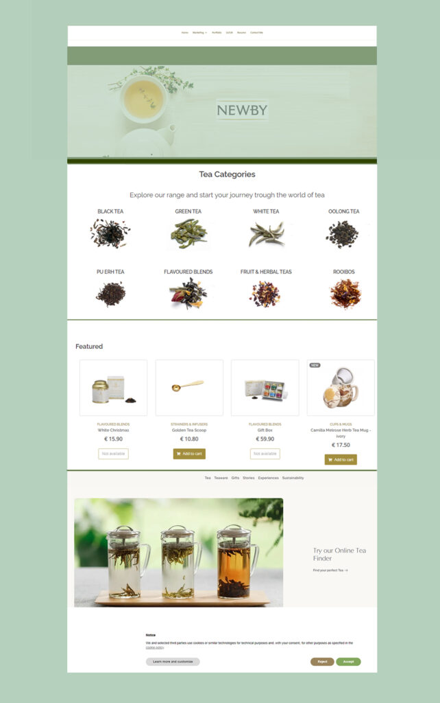
The website has been published to web flow-generated domain name for the client’s review. The sharing buttons will be created in the product and blog after the project switched to a paid plan as custom codes are not able to be embedded for free plan.

After meeting with clients in person, the followings are the changes need to be made:

- Brand Logo on the Nav Bar – remove the marble background - Workshops on ‘Class’ – add flip card animation to keep consistency
- Product Image – the actual product will be replaced by the photos of the food that represent the tasting notes. -Add a basket under the tea for the Lottie Animation on the landing page
- Spacing have to be adjusted as there are discrepancies between MAC and Windows
- Add Italian version to the Online Order Form
So I will start work on the 3rd revision, along with a google sheet that listed all the content needed with parameters to client within 2 weeks.

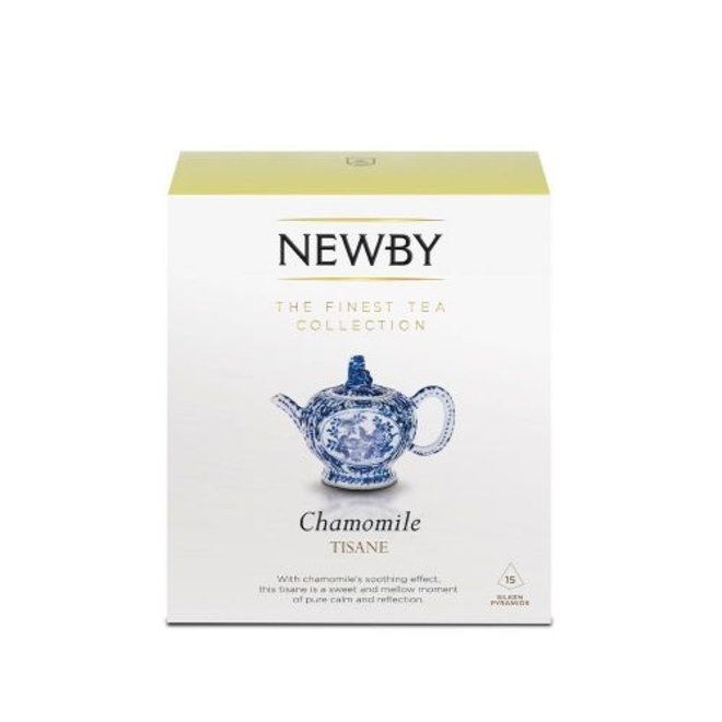
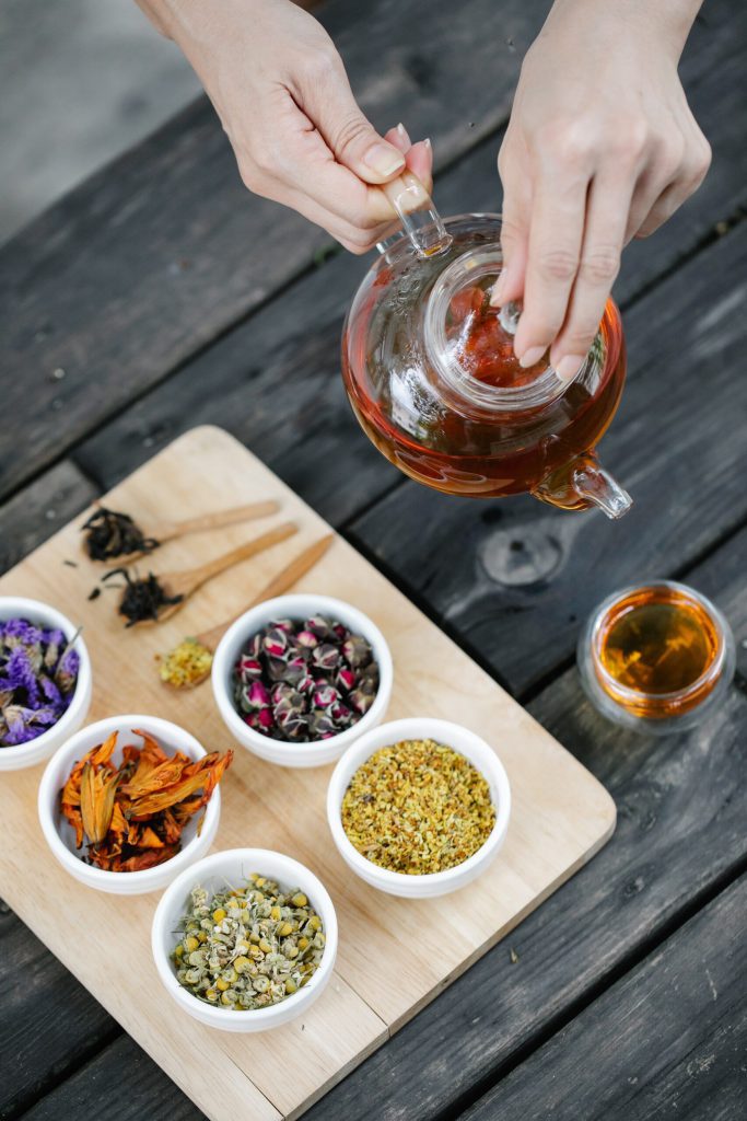
CHAMOMILE HERBAL TISANE TEA
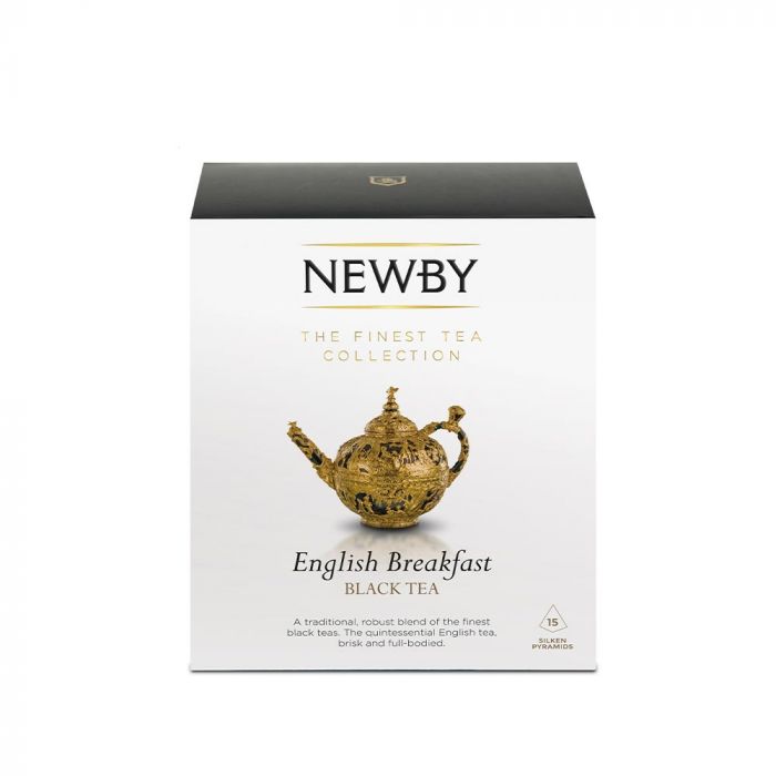
ENGLISH BREAKFAST

JASMINE PRINCESS PYRAMID GREEN