
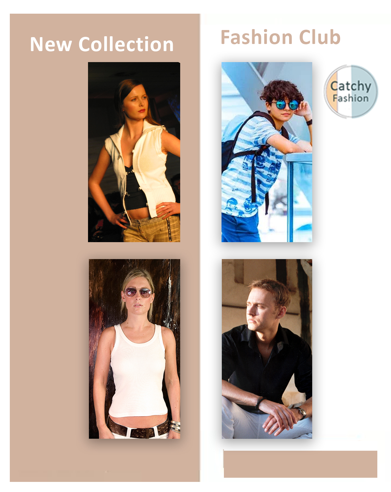
Catchy
Designing a Teenage Fashion:
Web Design/ UI/UX Design for an E-Commerce Startup
Web Design/ UI/UX Design for an E-Commerce Startup
UI/UX Designer, Brand Consultant Role Adobe XD, After Effects, Photoshop, InVision,
2 months Tools Timeline
Project Type

Target Audience
- Age Group: 15–25
- Financial Status: Middle class
- Work Profile: Fashion for younger consumers around the world.
- Country & Region: Southeast Asia
- Attitude towards technology: From those who tolerate technology to tech-savvy users.
Introduction
Although online shopping makes it possible to purchase clothes with just a click of a button, it does entail numerous problems. Not only is it difficult to choose the product in the correct size, but there is also the possibility of going through the return process if the product does not fit properly. No one really enjoys this, especially during a time in which it is recommended that we take extra precautions about going outside. Taking all of these into consideration, we are in need of features that will help us find the perfect fit. With that being said, I designed a responsive fashion e-commerce website called Catchy.
In order to develop this particular product, I chose to use the Design Thinking approach to guide me through the process. By following the steps, I was able to research thoroughly the fashion e-commerce industry before I proceeded to analyze the problem and ultimately come up with a product solution.
In the first days of the Design, we work with stakeholders that had all the users’ insights gathered in the recruitment process.
We use that to define our goals and questions we wanted to test by the end of the week.

The Problem
With the expansion of fast fashion, the industry has become the world’s second-largest polluter. People are noticing this problem and are turning to more sustainable fashion products. However, it is often very difficult to find these products since they are all over the place. Moreover, the public still lacks an understanding of the environmental harms of fast fashion, and many ethical brands lack awareness in the market. Thus, there is not yet a place that brings these shoppers and sellers together.
Empathize
Step 1 :
To be able to give our users what they need, we knew that we must first empathize with them. By exhibiting compassion for their feelings, thoughts, behaviors, and needs, we were effectively able to identify our users' pain points and solve design problems that came up. First was planning and research ramp up.
When we started the Catchy research, we didn’t know much about the website’s target audience since the description of “Teen clothing company from Southeast Asia” can include many important details. The first step was to understand the basics and nothing is more basic than demographics. By using Google Analytics data, we found that the main transaction makers were girls from Southeast Asia. However, more interesting data were found when analyzing the age of customers — about 43% of all transactions were made by parents in the age group of 17–22+
I used Google Analytics to, understand user behavior, where users are dropping off in the funnel, and the overall performance of their online store. One of Catchy biggest goals was to reduce the bounce rate. These were my findings:
1- Referrals (Social Media) were driving the most traffic to Catchy ’s online store
2- The two main drop off points on the site where the homepage and T-Shirt page.
During the months of October and November Catchy released their 2017 full product line, which had the highest bounce rate.
QUESTIONS
1- Does the Catchy Clothing brand align culturally with their target market?
2- Does their new 2018 fall clothing line meet the needs of their users?
Social Metrics
Instagram is Catchy’s strongest marketing channel and is responsible for driving most of the traffic to their online store. After analyzing the site performance and the social engagement the data began to tell a deeper story. Users were engaged with new promotional content and then converted to the online store. After browsing for a couple of minutes they would leave the site. This led me to a few questions that I wanted to explore in user interviews.
My goal was to understand
- Who are our users?
- What brands are users wearing?
- What are the important tasks and activities they complete?
- How do they behave and interact with other people?
- How well was it performing compared to the other brands?
- Where were the items positioned in the store?
- How much knowledge did the sales teams have about their product?
Product Goals
During this case study, I perceived myself as a user most of the time.
My solution statements to the challenges addressed above till now were:
. To provide all-in-one fashion information in one place.
. To give a satisfying readability experience with customizable content.
. To elaborate Teen-products as precisely as possible to the users.
. And most importantly, to provide a feeling of worthiness and importance to the users and to build a self-confidence among them with the help of improving their lifestyle and sense of fashion.
Step 2 :
Purchase Behaviour
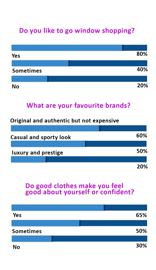
The next step was to find as much as possible related to purchase behavior. So we started with a customer survey in order to understand where they look for ideas and inspiration before making a purchase. And again, we were surprised that with the ability to choose more than one option the most popular choices were “Catalogs” and “Fashion Magazines”. At the same time, only 6% of respondents make purchases on catalogs released by the client while the majority of respondents make purchases on the website we did the research for.
Another valuable finding from the customer survey was that more than half of respondents makes purchases on the website multiple times per month. Therefore, special attention should be paid to emphasizing “New” collections or items and users should be able to find specific items and overlook categories without extra effort.
Finally, we wanted to understand how users consume products provided by the brand. By data of online orders was found that TOP 3 most bought products were shirts (1), jackets (2), and pants (3) which in total made almost 70% of all orders. Because of the high purchase data, these categories can be used when planning monthly promotions, seasonal campaigns, or deciding on category blocks on the homepage.
Step 3 :
User Interviews
I conducted interviews with users who are familiar with online shopping to identify their needs and pain points.
- I conducted interviews over the course of two weeks at a skatepark to understand skateboarders current lifestyle, their impression of XYZ Clothing’s brand identity, ambassadors, and the new 2017 fall collection.
- I was responsible for recording videos, taking notes, analyzing qualitative feedback, visualizing quantitative results, and presenting insights (e.g. User pain points, SWOT analysis) to the various stakeholders in the team, including researchers, product owners, and investors.
Because a wide range of demographics enjoys online shopping, I interviewed a total of four participants between the ages of 15 and 25. Their professions varied from student and young employees.
Interviews I wanted to gain gain some insight into the thoughts, feelings, and needs of the users
Step 4 :
Motivation and Concerns
After understanding the main characteristics of the website users, and their interests, we wanted to find out more about the reasons why they are buying clothes exactly at this store and what are the main pain points that distract users from making a purchase. At this point, we read LiveChat transcripts, Surveymonkey post-purchase surveys, analyzed User Interviews and Heatmaps, watched a lot of user session recordings and talked with Customer Service.
Our summary of findings revealed that there are 3 main reasons why customers prefer this store.
- They appreciate the style of clothes — it looks fashionable, items feel comfortable.
- The website allows users to easily find matching items and create a set, hence customers can look good without spending too much time on finding the perfect outfit.
- Many customers appreciate the ability to have a chat with fashion consultants to create personalized clothing or adjust items according to their sizes.
When analyzing the complaints and questions, we discovered three main pain points.
- The first one worry about the item fit. Unlike when visiting a real-life clothing store, in an e -Commerce store users can’t touch the item, try it on and evaluate details e.g. Color.
- Users are worried about the delivery times. During user interviews a participant said that “I want to buy the item NOW”, hence the delivery policy should be clearly explained.
- Potential customers are worried about the price – quality relationship.
- Users are worried if they’ll have any options to return an item and get their money back. This means that any information regarding the return policy should be easy to find.
- of LiveChat ArchiveThanks to this information, we were able to divide two customer types to focus on when planning a user journey: User Persona #1 who:
- pays attention to small details
- wants to wear an item today
- Visits fashion consultants.
User Persona #2 who:
- is looking for sale items
- before making a purchase on the clients website will check the websites and department stores to find the best deal
- Does not want to spend extra money on additional services.
Step 5 :
User Interviews
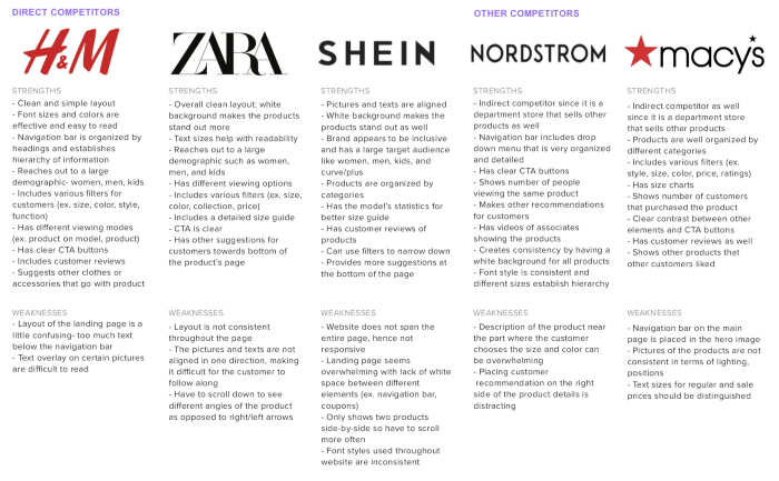
I conducted this step in a very short time, just to get the information about major competitors in the industry. A few more problems were found out while looking at the bad reviews of users of Zara, H&M, etc.
People complained that these apps sometimes went too buggy, some of them said that the apps had very fancy user interface which was non functional at times, some didn’t like the interactions while some of them just directly blame the UX team.
Taking in mind all these major issues (though faced by only a few users), I continued with further research. These apps told me a lot of stuff about the kind of typography, color scheme, and imagery that had to be used.
Other factors
In this phase, we prepared a summary of other factors that might affect purchase decisions, but are not crucial when planning conversion rate improvements — what professions users have (customer survey), how they spend their free time (customer survey), how seasonality affects purchase behavior (Google Analytics) and what customer characteristics can be found in social media (Instagram) e.g. How customers feel when they are wearing the brand and if there is a social proof that might affect buying decision.
Final outcome — User Personas
The final step is to summarize all the insights. After user research, we had a clear understanding of what is the main target audience of the website, what users expect from the store, what motivates them and what stops them — a lot of helpful information to consider when planning website improvements.
Define
User Persona, Empathy Map, and Project Goals
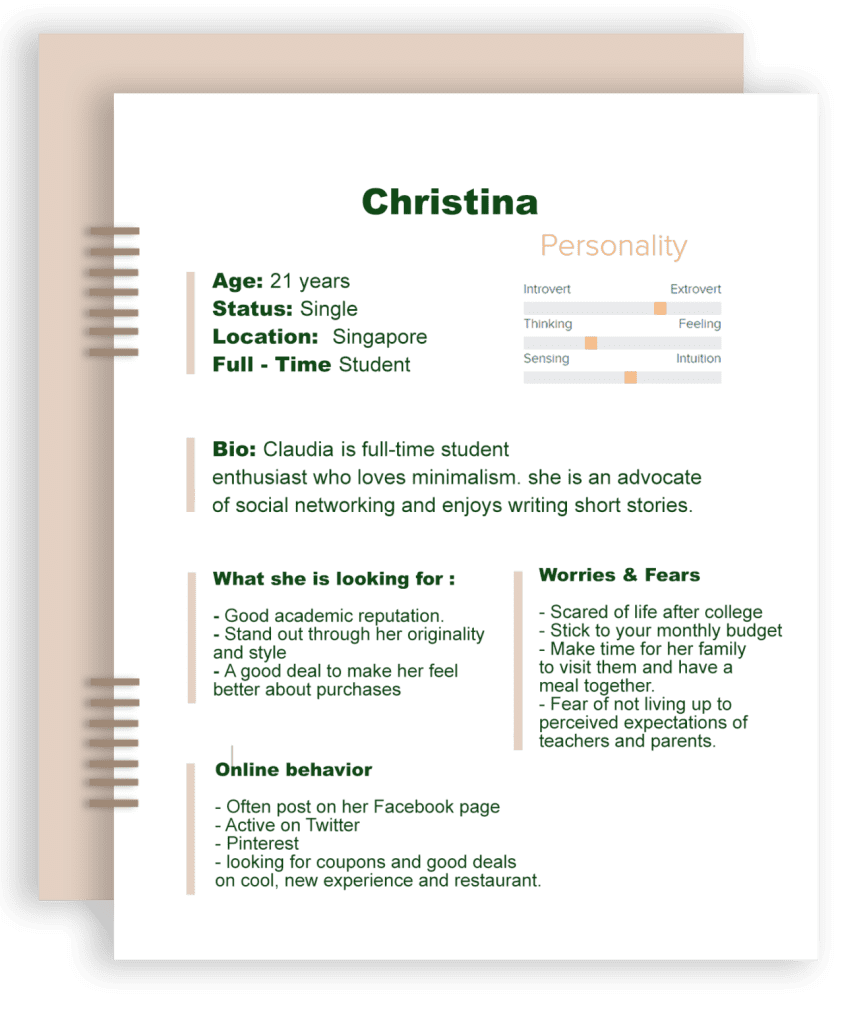
The next step in the process is to define. With the research conducted thus far and the findings from the user interviews, I was able to figure out what will be created, for whom, and how.
User Persona, Empathy Map, and Project Goals
Based on the insight provided the participants during the user interviews, I created a persona that reflects various needs and pain points.
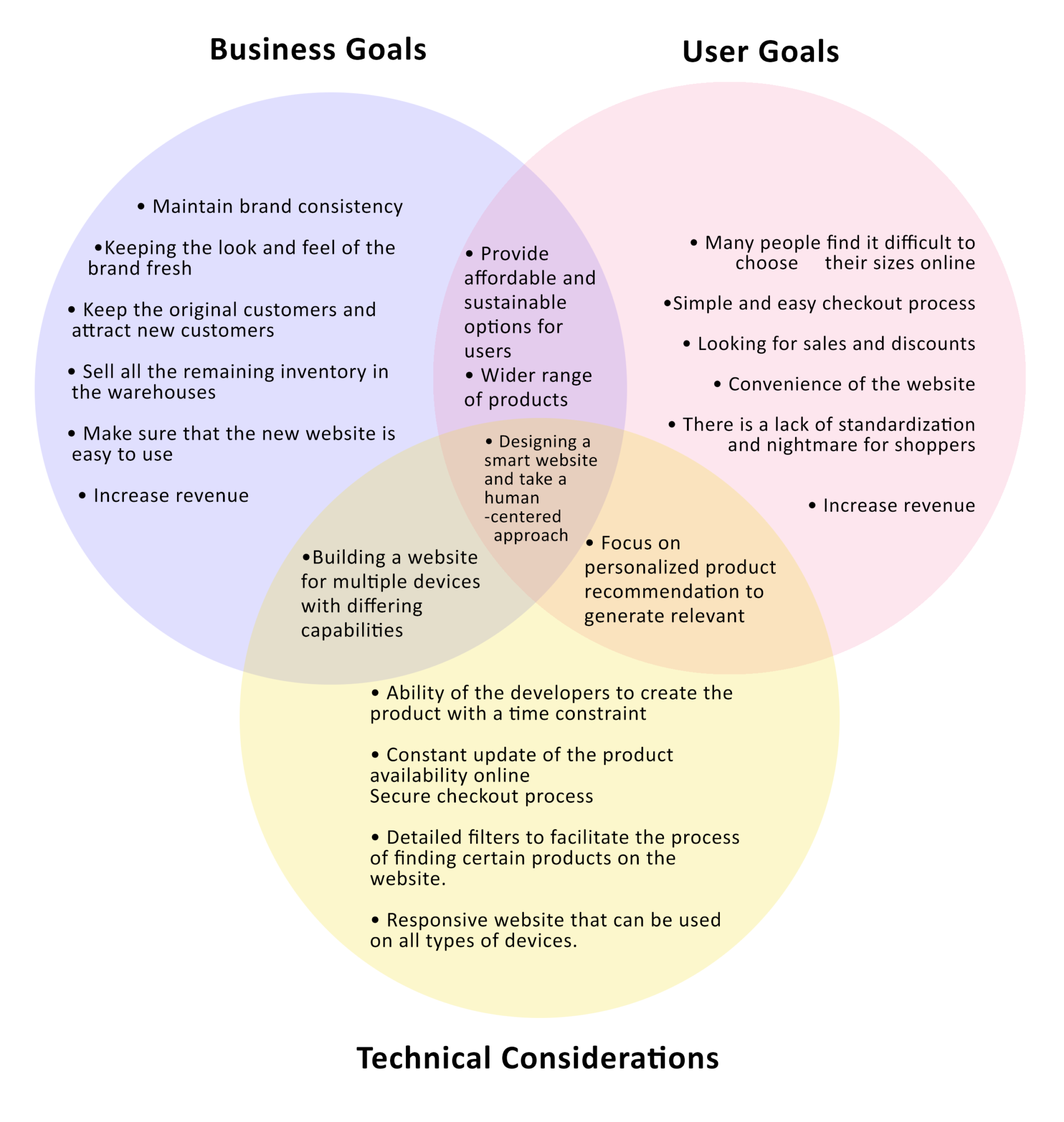
Once I had my user persona and empathy map ready, I took a step back to get a clear overview of both the business goals and the user goals. In addition to those goals, I wrote down the technical considerations as well.
Problem Statement
After the goals have been identified, I came up with a problem statement that I could refer back to as I proceed with the design process.
How might we design a fashion e-commerce website for those who shop online so that they can have a more efficient and error-free experience?
IDEAE
This stage of the Design Thinking process focuses on taking a creative approach and generating ideas. With the findings that I synthesized from the previous steps and the problem statement that I made earlier, I was able to think outside the box. I created a number of deliverables that could help me identify and visualize a solution.
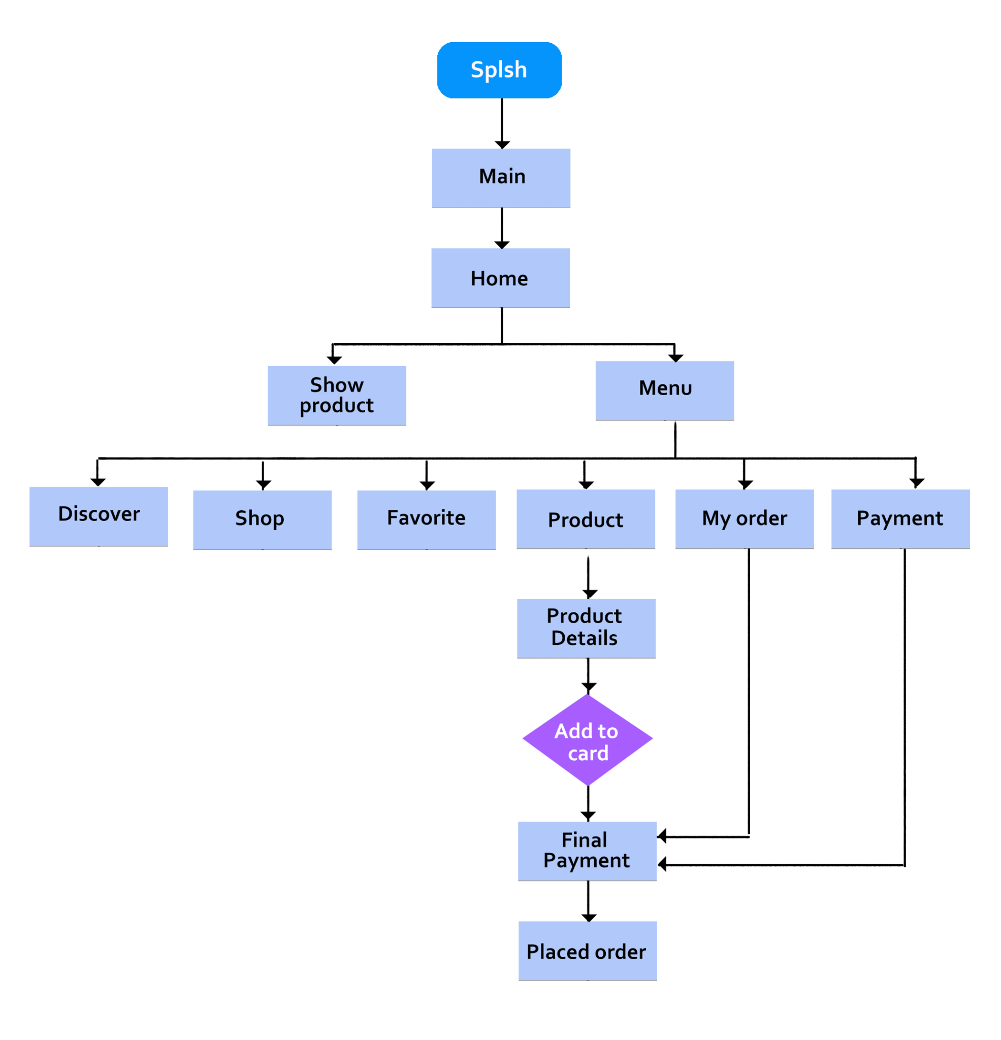
Task Flow
With the problem statement in mind, I developed a task flow to show the ideal flow that the user would take to complete a task on the Mirror’s website. In this particular case, it focused on finding and purchasing a product from the website. Working on this helped me identify the key screens for my design.
User Flow
Once I completed the task flow, I then proceeded to create a detailed user flow. This essentially illustrates the various paths that the user can take to complete a task. Creating this flow allowed me to think from the user’s perspective and consider the different options that the user has while using Mirror’s website.
Card Sorting
In order to see how users like to organize content and determine the information architecture of the website, I used open card sorting with the same four participants from the user interviews. I prepared a total of 20 cards and asked them to sort them as they see fit.
Summary of findings from card sorting:
- Three out of four participants categorized the items by clothing types
- One out of four participants categorized them by style/occasion
Information Architecture
By incorporating the findings from the card sorting, I was able to group the different fashion items in certain categories and planned the layout of the website accordingly.
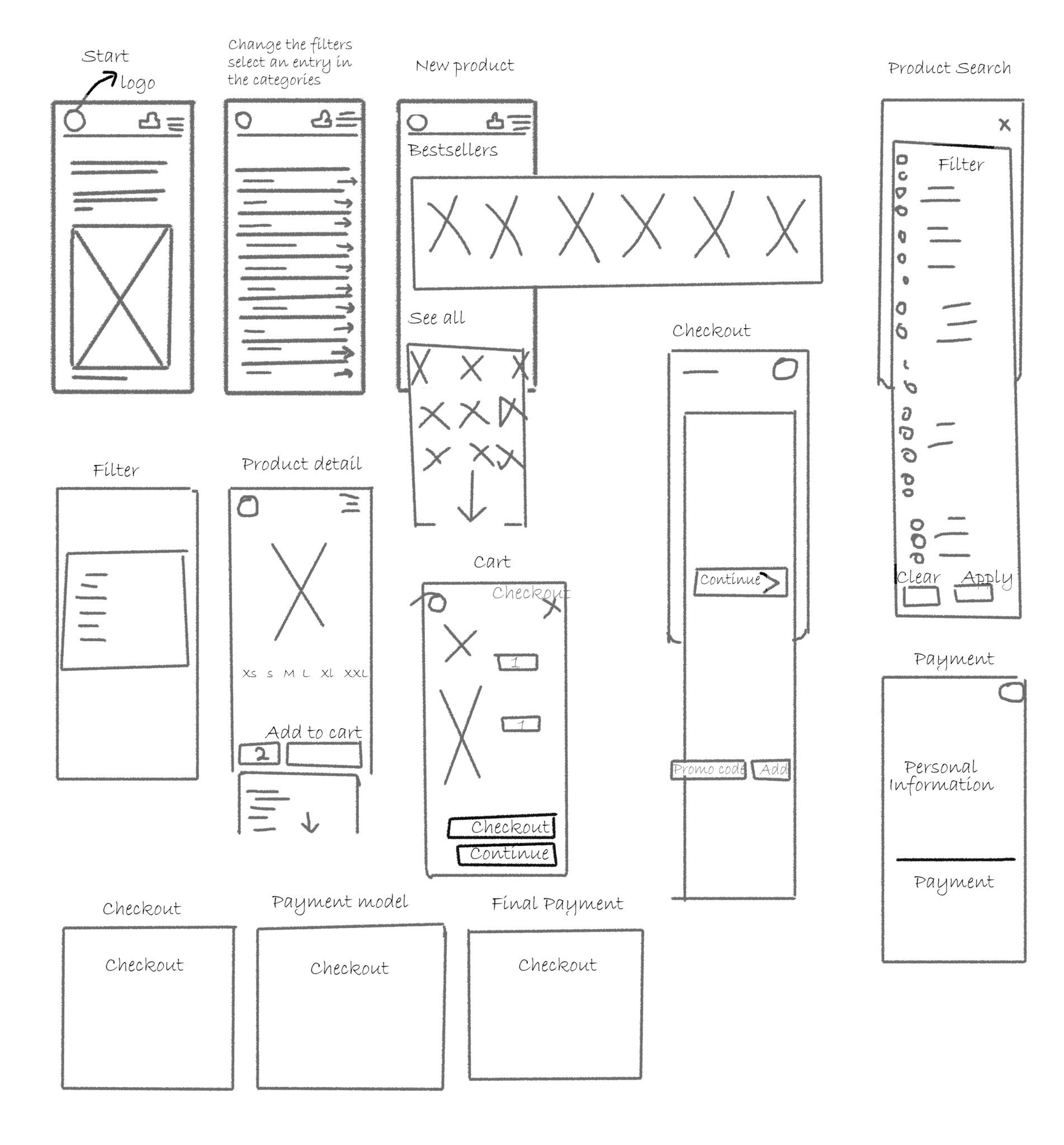
With my sketches by my side, I began to develop several mid-fidelity wireframes on Figma. These wireframes included the Homepage, Category Page, Product Details Page, and Checkout Pages.
Sketches and Wireframes
Once the information architecture was ready, I made some sketches of Mirror’s Homepage to get an idea of what it would look like. Because all of the participants from the user interviews mentioned that they prefer to use their computers when they shop online, I decided to focus on developing the screens for the desktop version..
Mood Board
Because I wanted to design a website that is simple yet modern, I created a mood board that reflects those ideas.
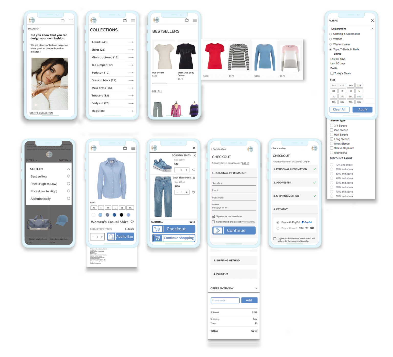
UI Kit
With the inspiration that I was able to get from the mood board, I then went on to create a logo that is simple as well. Afterwards, I developed a UI Kit that aligned with the aesthetics and brand identity that I was aiming for.
PROTOTYPE
The next step in the process is to make a clickable prototype so that the users can test it out. Following this step allowed me to gather feedback regarding the product and try to figure out the best possible solution for the problem.
Design
Wireframes, being one of the most important parts of the design phase (also, initial) play a significant role in the entire phase. I designed few rough sketches (low-fidelity) of major screens on a large piece of paper and stuck it on the wall as I continued turning it into a high-fidelity mock-up.
User Journey
Journey mapping starts by compiling a series of user actions into a timeline. Next, the timeline is fleshed out with user thoughts and emotions in order to create a narrative. This narrative is condensed and polished, ultimately leading to a visualization.
In the image attached above, I have shown only two paths of journeys just to give an overview of how the successful journeys will end up starting from onboarding and ending with the conversion.
In this case, the conversion how many people read an article, then like and share it with other people.
Sign Up is an optional thing to do at the beginning, but for liking and sharing an article the user must need to sign up.
Information Architecture
Information Architecture focuses on organizing, labeling, and structuring content in an effective and sustainable way. The goal is to help users in finding information and complete tasks. It is most of the time an outcome of card sorting. In our case, information had to be structured in such a way that users can easily navigate through the app and enjoy their articles.
Wireframes
Information Architecture focuses on organizing, labeling, and structuring content in an effective and sustainable way. The goal is to help users in finding information and complete tasks. It is most of the time an outcome of card sorting. In our case, information had to be structured in such a way that users can easily navigate through the app and enjoy their articles.
TEST
Low-fidelity
4. Home Screen
Home Screen shows all the personalized sections of the user starting with sliding cards showing the most trendy articles, followed by the top brands, through which the user can drive directly to stuff being posted on that brand’s website, along with other sections.
5. Category and Reads
The Category includes all the subsections like footwear, clothing, accessories, etc. Reads have all the trending articles at the top, followed by some famous fashion and lifestyle magazines. I kept the UI flat, dichromatic and simple to coincide with the product goals, keeping the principles of emotional design in mind.
Considered the final step in the Design Thinking process, this step focuses on testing out the prototype. It is also an iterative process that gives me the opportunity the evaluate whether my design solves the problem and redesign any parts of the product if needed.
Usability Testing
I conducted remote usability testing using a high-fidelity desktop prototype. It was conducted to test the flow of design, ease of navigation, and the extent to which the design accurately reflects the brand’s values. The test was also used to see whether the design solves the user’s needs and pain points that were captured during the research phase.
The test was conducted with a total of five participants between the ages of 18 and 50. Each of the participants were asked to complete the following tasks:
- From the homepage, show me how you would find Women’s Tops in size “Small”
- Find a product called “Swim pants ” and add it to Shopping Bag
- Purchase a product using Guest Checkout
The usability testing plan can be accessed
The detailed report of the findings from usability testing can be found
Here are the key points from the feedback received:
- Participants thought that the website could be inclusive by offering more size options
- There is a need to include an icon that allows the user to view more products at once on the Category Page
- Participants wanted to see all the applied filters and have the ability to clear them on the Category Page
- Participants expressed the need to change the input field for Quantity on the Product Details Page to ‘1’ since it is assumed that the user would purchase one product
- On the Shopping Bag Page, participants noted that Quantity should include an icon to make it easier to edit

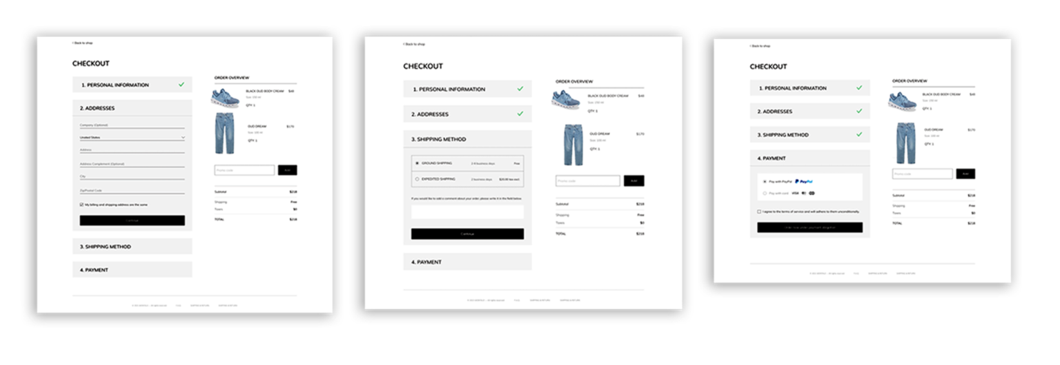
Priority Revisions
With the feedback provided during usability testing, I was ready to make the changes to some of my designs.
Revisiting the Problem Statement
How might we design a fashion e-commerce website for those who shop online so that they can have a more efficient and error-free experience?
The problem was solved by:
- Including numerous images/videos of the product that allow the user to closely examine the quality of the product
- Providing a size guide, specific product details, and information regarding the model to allow the user to determine the sizes more accurately
- Implementing filters that enable the user to refine searches easily
Next Steps
With the priority changes that were made, I can conduct another usability test to see whether the revisions have solved the issues that were previously brought up by the users. If needed, I would have to do another round of iteration and testing. Once these steps are complete, I can hand off the project to the developers.
Learnings
- By incorporating the Design Thinking approach, I was able to empathize, define, ideate, prototype, and test. Through this particular process, I was able to understand the ways in which each of the steps could be used to help develop the final product.
- During this project, I found the user interviews to be quite helpful as they provided insight that I originally did not think of. Doing so taught me the importance of removing bias as I conduct research.
- In addition to that, I learned the importance of empathizing with the user. Not only does it allow me to better understand the needs and pain points of the user, but it also enables me to address the problem in a human-centered manner.
- Most importantly, I learned that design is an iterative process that requires much time and effort. Despite the fact that I came up with a product solution, there might be ways in which I can improve user experience with technological advancement over time.
Conclusion
Although this entire process took quite some time as it was my first time working on a UX project, it was a learning experience that truly taught me a number of important skills that a UX Designer needs. With my newly attained knowledge and skills, I feel more confident in my ability to tackle new projects.