
Furniture
Gozzini
Home Furniture
Gozzini
Industry:
Furniture
Task:
End-to-end Mobile Application
Background and Goals
Gozzini is a new app for interior design. Trade, there are both contractors and interior designers who will help to execute the home renovation process.
- Users should be able to select any type of furniture (e.g. Small objects like boxes or up to something as complex as kitchens) and see it in augmented reality through their smartphone or tablet.
- The session should be conducted entirely within the app.
- Users should be able to be recommended products by the specialist both during and after the call.
- Gozzini is currently scanning all the catalog items featured by these stores and setting up processes to keep their catalogs updated.
- Gozzini already has partnerships with furniture stores and their team is working hard on establishing more partnerships in the future.
- Stretch goal: Create the web interface for the interior design specialists to provide support for the service effectively.
- Project goals
-Design an iOS app that allows users to view a catalog of furniture and place it in their home via AR.
– Design a brand identity that conveys Gozzini’s vision.
Problem
Gozzini wishes to use the latest visualization technology such as AR to allow users to view furniture in their own spaces. Users should be able to browse, purchase, and get ideas based on the design needs of the platform.
I struggled to pitch my idea across to my ID and the rectifications of the 3D design put me off. It was inefficient and time-consuming.
We need to find the right usage for it and bring it to customers by solving a problem that they encounter or by providing additional value to their current goals. The long-term success of this project can be tracked by tracking the conversion rate of users who utilize the AR function versus those that do not.
Identifying our user
We narrowed it down to two main types of users:
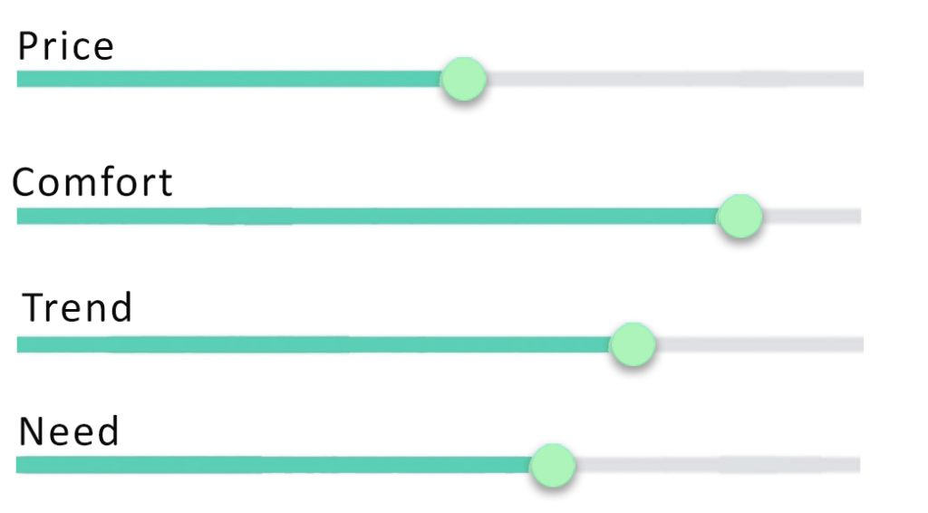
1- (60 %) stands for Utility, Comfort, & Originality. The user who knows their style, but still needs advice about certain interior decisions.
2- (20%) of those surveyed value someone else’s opinion when making home decorating decisions. The user who doesn’t have confidence in interior design skills due to lack of knowledge and needs more support. Both users care about their interior aesthetics. They might not invest in an interior designer, but they see the value in extra guidance.
Observation
Given the tight deadlines, we managed to conduct user interviews with approximately 10 users within a week. Through these interviews, we managed to deduce behaviors, draw insights & findings, and eventually make a conclusive conclusion to it.
Solution
Through extensive secondary research into the furniture, interior design, and AR/VR industry, a competitive analysis, and user interviews, I was able to determine the necessary content and features of the app. By creating a persona, mapping out the user’s ecosystem, and understanding their problems and user journey, I was able to structure the information and visuals on the app to suit the user. Using this information, a logo, color scheme, typography, and UI kit were produced, and
- Storage: A way of keeping visual track of all of her furniture and home decorations, as Vandana keeps some in storage for later use.
- Floor plan: An app that creates a floor plan with the help of her phone camera & measurement input.
- Virtual Reality: An app that can show how a new piece of furniture/home decoration looks like in a current room, by means of inputting an e-commerce URL.
- Shopping: To inspire Vandana in the form of an automated created mood board when uploading a photo of a room with sharp able suggested items.
- Troubleshooter: An app that thinks along with Vandana when she faces common space/redecoration problems.
- Inspiration: Community shared video content with ‘how-to’ and other inspirational redecoration topics.
Tools Project Process
Prototyping — Crafted Low-Fi/High-Fi visuals and prototyped it
Evaluation — Finally, we conducted A/B tests and evaluate them against different metrics to measure our success.
We used Pen and paper, Figma, Trello, Slack, Zoom, Google Slides, Forms, and Photoshop.
Design Thinking Process
Research
1- Qualitative research
2-Market Research
3- Identifying target audience
4- Gather data
5. Product Benefits
6- Interior design trends research
7- Pricing study in market research
8- Competitive analysis
Define
1- User Persona
2- User journey map
3- Product Roadmap
4. Mapping the customer journey
5- Ecosystem Mapping
6- How might we statements (HMWs)
7- Business model Canvas (BMC)
8- Problem statement
Ideate
1- Low fidelity wireframes
2- User interface design:
- Build your brand strategy
- Logo
- Color Scheme
- Typography
- Brand language
- Choose a logo and slogan
- UI kit
Testing
1- Prototype
2- A/B testing
3- Customer Feedback Database
3- 4-Customer Effort Score (CES)
1. Research
User Interview
We identify several mobile apps as our target for this case study. Consumer wants and needs started to change significantly. Over the past year, people became more comfortable shopping online for all kinds of products, including furniture, which was once thought to be unsuitable for e-commerce first sales. Over the course of the project we redesigned the original Guzzini Store app to provide customers with a potentially more enjoyable in-store shopping experience. We must take advantage of advanced technologies to deliver quality digital experiences.”
Needs
- Quality Furniture.
- Comfort and lifelong furniture
- Competitive Pricing.
Wants
- Cool design stuff
- Consumers want choice
- Unique and personalized for my space.
- Interior designer’s suggestion
- Introduced the stock model
- Conclude With a Satisfying Delivery
- Color Matching ideas
- share the model of social network with friends
Opportunities
- Provide an offer
- Creating a happy lifestyle image
- Using social media
- Tracking engagement
2. Define
Demographics
Persona Development
Katerina Schneid
Katerina just bought a new house and want to move with her family there. She wants to decorate the new house in the
New style. She knows her own style enough and want to make her own design decisions. She needs a way to seek advice from an expert so that she doesn’t waste time and energy making the wrong decisions. Goals
Her dream is to become a travel blogger and she works to fulfill her dream someday.
Frustration
Missing the something that is trending
Katerina’s Journey — One way to navigate the prototype
Intro
Let’s help Katerina find some advice and inspiration for his living room!
Styleboard
Katerina is still unsure how the designer will give her personalized advice, but he notices the optional style board feature.
Booking
She then goes through the booking process and opts for the 30 min session.
Measuring
Katerina wants to prepare for her call because she wants to get the most out of her time, and she is a busy person
Before Call
Katerina now believes that Bryan has enough information about her style and room to give her personalized advice to her.
Video Call
Bryan introduces the AR function, which is perfect for Katerina since she struggles with design decisions, and this allows her to get an idea of what each piece of furniture might look like in her home.
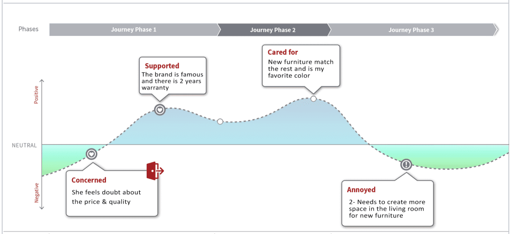
User Journey Map
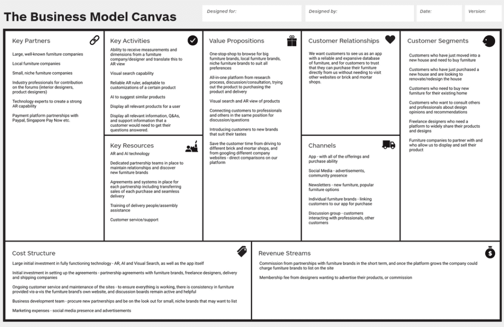
Business Model Canvas
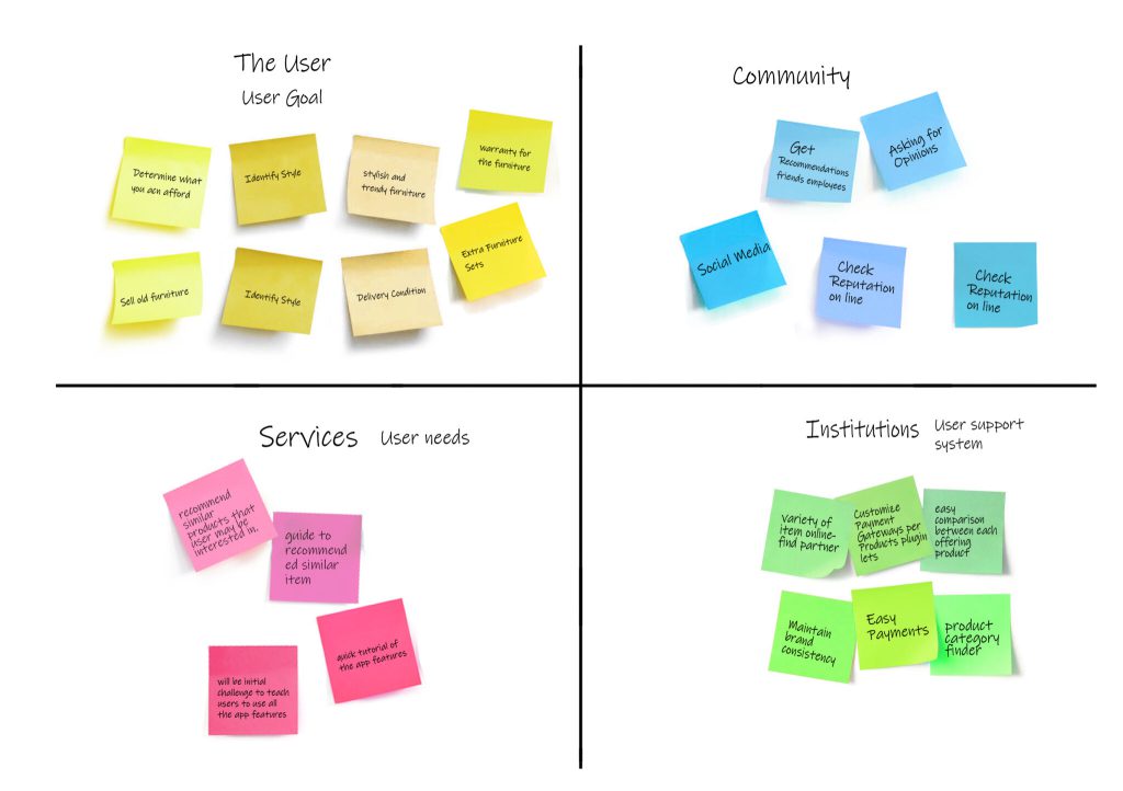
Insight
Users want to feel like they have exhausted all available options before purchasing furniture
Users are using offline means (measuring tape/drawing out the actual size) to judge the size of furniture
Users consult similar websites for their furniture needs, not exposed to the smaller brands
Users don’t want the same furniture as everyone else
Not many users have used AR as a tool to assist with the purchase decision
Users expect an all-in-one experience
Need
To know that the furniture they are going to buy is the best option.
To get exposed to a variety of brands to see all available options and designs.
Unique, limited edition furniture, or furniture from more unknown brands.
Sufficient detail on the platform, and an option to chat with someone further if the user has more questions
Business Model Canvas
Problem
New homeowners today prefer to engage contractors because it eliminates middleman costs, but it places an additional burden on their time and ability to design and envision their dream home.
HMW
How might we help the user visualize the product in the intended location?
How might we gather information about the user’s preferences to suggest a variety of brands that would suit the user?
How might we teach the users how to use AR, and impart to them the benefits of using AR on their furniture decisions?
How might we ensure that the end-to-end purchase experience all existing on the platform?
3. Ideate
User interface design
UI Kit
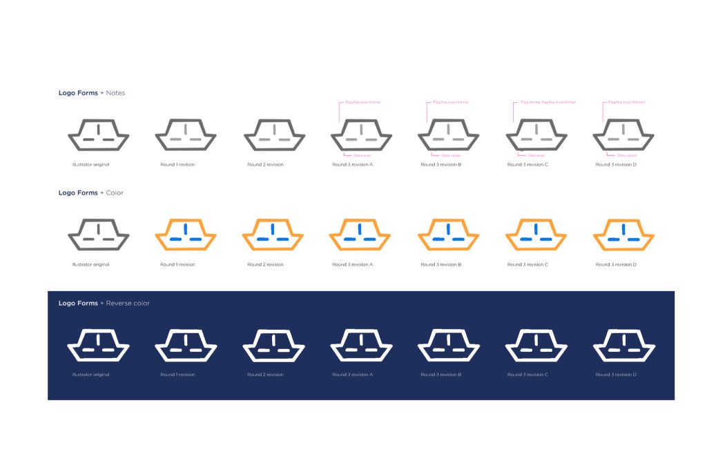
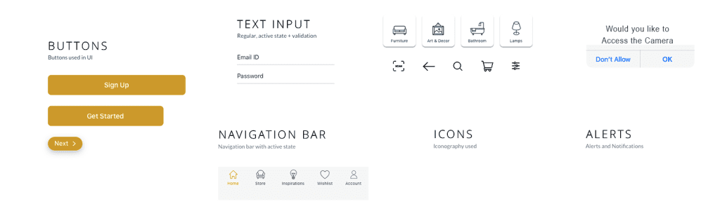
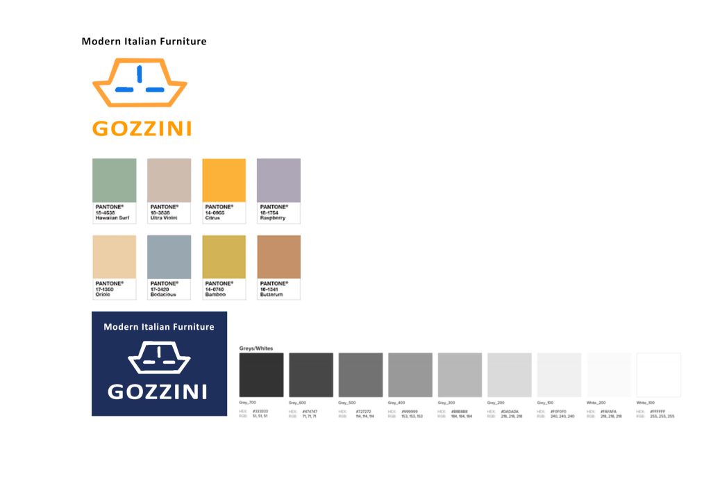
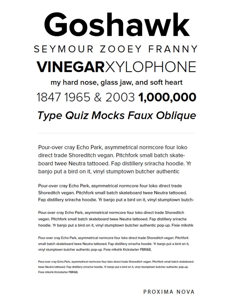
Image Style
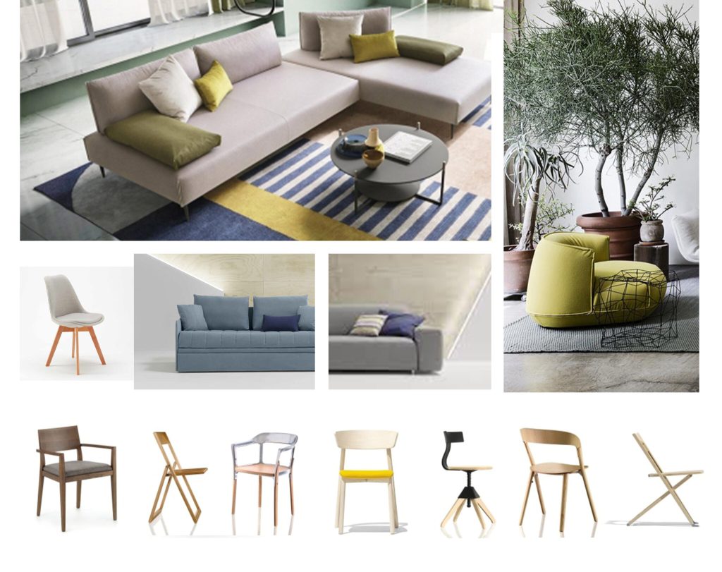
Color options
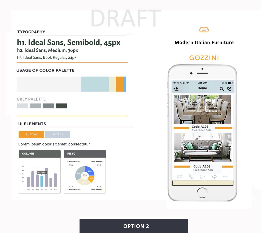
Option 2- Client’s choice
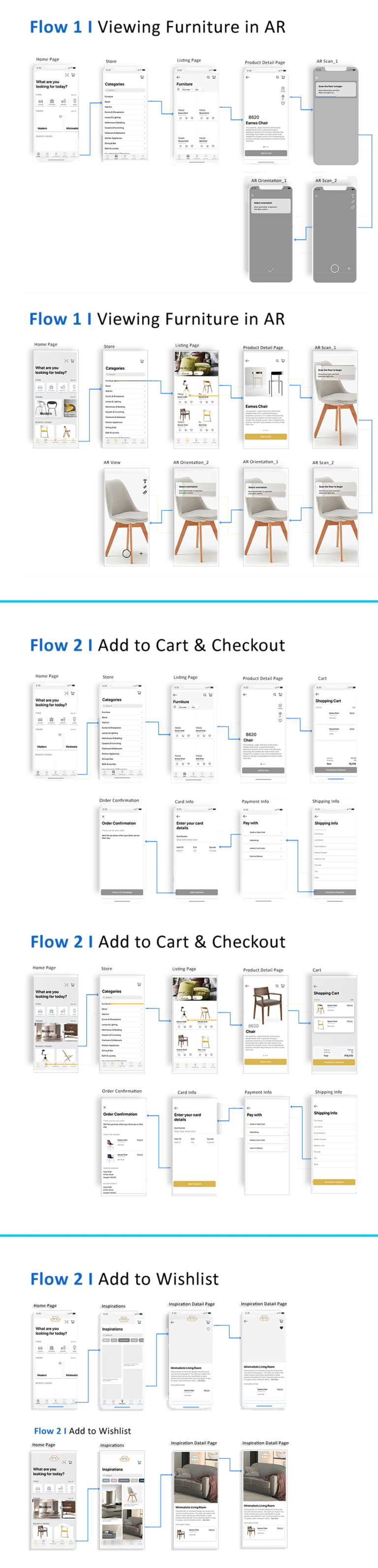
User Flows
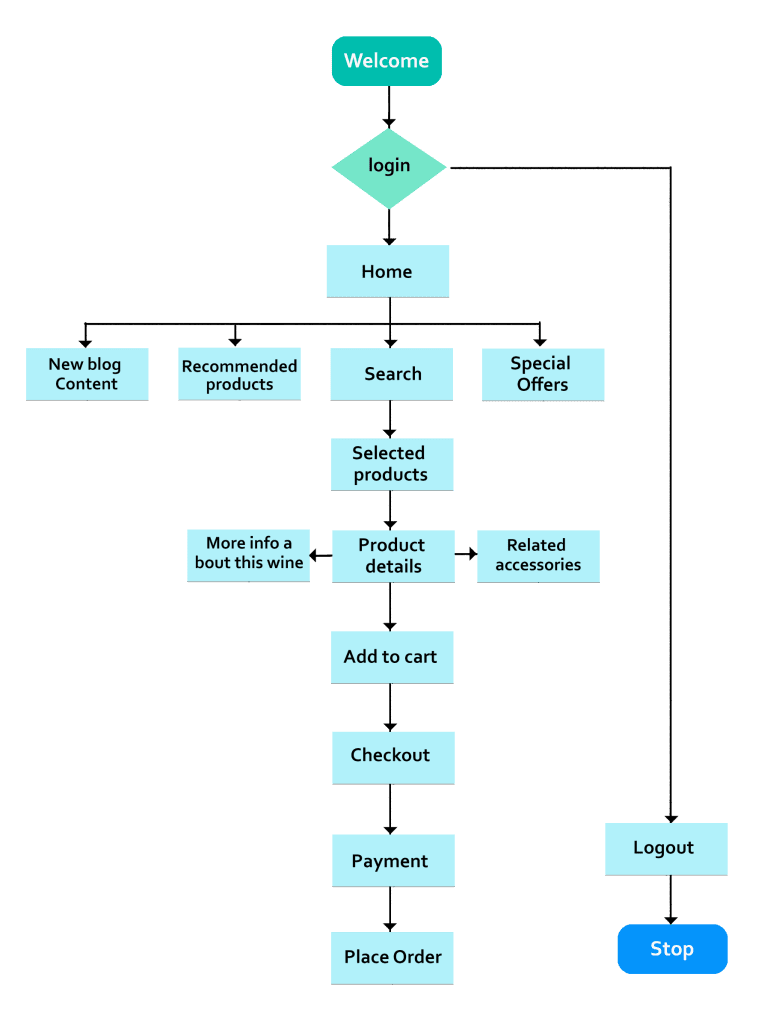
Video Chat
We designed an augmented reality furniture display to give users an idea of what a piece of furniture would look like in their home. When a user sees something they like, they can take a picture of it with their phone.
Accessing the tool was a little confusing for some users to operate
- It was not clear that you accessed the menu via swiping up.
- I used an arrow to indicate the direction of movement,
- Then I tried a message box,
- Finally, I changed it to a row of dots (page Swiper) to access the tools.
4. Testing
Test Plan and Feedback Grid
A first impression and task-based user test was carried out in-person and over video conference covering navigation, features, colors, branding, and general feedback. Comments were documented in a feedback table so that I could sift through the revisions that needed to be made.
First Click – You stumble upon Gozzini while looking for furniture. What do you read about first, what do you click on first? Why? Are you looking for something in particular
First Impressions – What is your first impressions of the A. Branding – B. Color – C. Layout – D Navigation? Other general feedback?
Testing a mobile app — on a computer does not yield great usability results. Gesture movements aren’t as intuitive, and inconclusive data are collected. It would have been better to test the app on a mobile device.
Not everything Apple does is right. Using symbols and gestures that Apple uses aren’t actually that intuitive for all users. The dots for page control, for example, usually aren’t accessible. Symbols used to show things can move weren’t always understood.
Conclusions
The goal here was to create an online experience that reinforces and continues in-store experience. The in-store experience includes beautifully set displays and attentive sales people. A more attractive online store that allows customers to browse freely and be inspired will help them feel more ready to purchase when they come into the store or allow them more confidence in buying online.
Overall, this project has achieved its goals and users expressed excitement and enthusiasm when interacting with this app.
A few key points of reflection from this project include:
-
Design thinking provides layers of insights. Especially during the research and usability testing phases, I was able to really see the iterative nature of design thinking. Engaging directly with users throughout multiple phases of the project process allowed me to stay consistent in empathizing with my users and keeping them at the focal point of all design decisions.
-
Usability testing yields actionable feedback that inevitably builds a stronger product. The pinpointed feedback from users while they directly interact with the prototype is extremely valuable in evaluating what is and isn’t working.
Ideally, multiple rounds of usability testing would have provided validation for each prototype iteration once user feedback was incorporated, but having even a few key insights from users helped me get out of my head and empathize with how users were navigating the app.
While some of the feedback was unexpected, it provided a challenge to work within certain constraints and empowered me to find a way to create a user-friendly design.
-
Designing with limited resources and time can still make an impact. I learned that it is possible to use creativity to explain an idea and message for a more complex project even without the appropriate time or resources.