The private tutor looking for students and still, it is not easy to find new students. I have to do a lot for advertising like publishing posters, social media, local listing etc. Search the App instead of the street. I tried creating an app which would minimize the gap between students and tutors.
User Survey
Goals
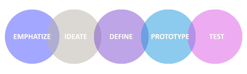
My primary goal is to improve the entire experience of using the app, along with ensuring what the users actually need for which I’ll be doing the UX process from scratch.
Usersresearch – Knowing the users
I conducted a survey using google forms to get an idea about how people use the app.
In this project, I have used the user survey to fathom people’s practices.
The sample size of the survey is 25 and I had used Google form to record the survey. Shown below is the quantitative data based on the survey.
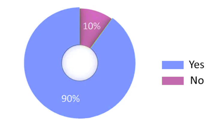
How hard is it to get a home tutor?
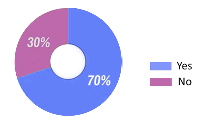
If our tutor reaches at your doorstep for classes will you be exited?
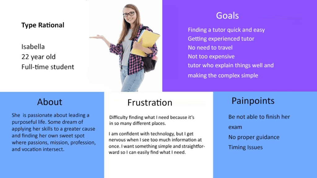
The personas range from 17- 25 years of age and all are assumed to be familiar with the technology.
User Interview
After conducting an online survey to analyze user practices, I interviewed five people who had difficulties in finding a tutor. Below are the sample questionnaire asked in user interview,
How hard is it to get a home tutor?
Different medias involved in the search process?
Criteria for an ideal tutor?
How effective is the current system?
User personas
I have created 2 user personas, named them according to their regular lifestyle and drew their visual representations.
Next, I scripted a typical daily feeding routine for my persona. This process helped me decide how the app’s user experience might be designed to fit in with a feeding routine.
Define
Challenges
The challenge was to design an app to give an innovative solution to people’s complex problem by incorporating the principles such as aesthetic-usability, easy navigation between the screens, legibility, affordance and minimal performance load.
Because of the variety of Intended audience, designing a universally easy to use app that wouldn’t add the burden of adding timetable to the process of requesting class was the biggest design challenge.
To initiate an engaging factor for the users.
To simplify the visual and functional aspect of the app.
To make the requesting, cancelling in easy way.
To create an app which would be well received across various age groups.
More than 80% of people are unsatisfied with current system.Experience, behavior and teaching skills define an ideal tutor. Many websites providing details of tutors are available now and still the results are not satisfactory. One have to make an advance payment to get the details and if the teacher is not available then the money and pain is in vain.
I narrowed these points down to:
Pain Point 1: Users are confused about where to search for a tutor.
Pain Point 2: Teachers work are not quite good enough …
Pain Point 3: High Cost.
Pain Point 4: No proper continuous guidance.
Pain Point 5: Need Regular classes.
Design Features
Design Features
Based on the insights from the above experience, I conceptualize to enumerate the main features which will make Learn at Home a solution to the issue.
Users can pick up the subject
Selecting a calendar Date and Time
The users can know the tutor before the pickup
Course description
Payment and booking online
Rescheduling or cancellation
Chat facility to interact with tutor to clear the doubts even after the class.
Access to the past lessons and upcoming lessons
Monitor learning progress
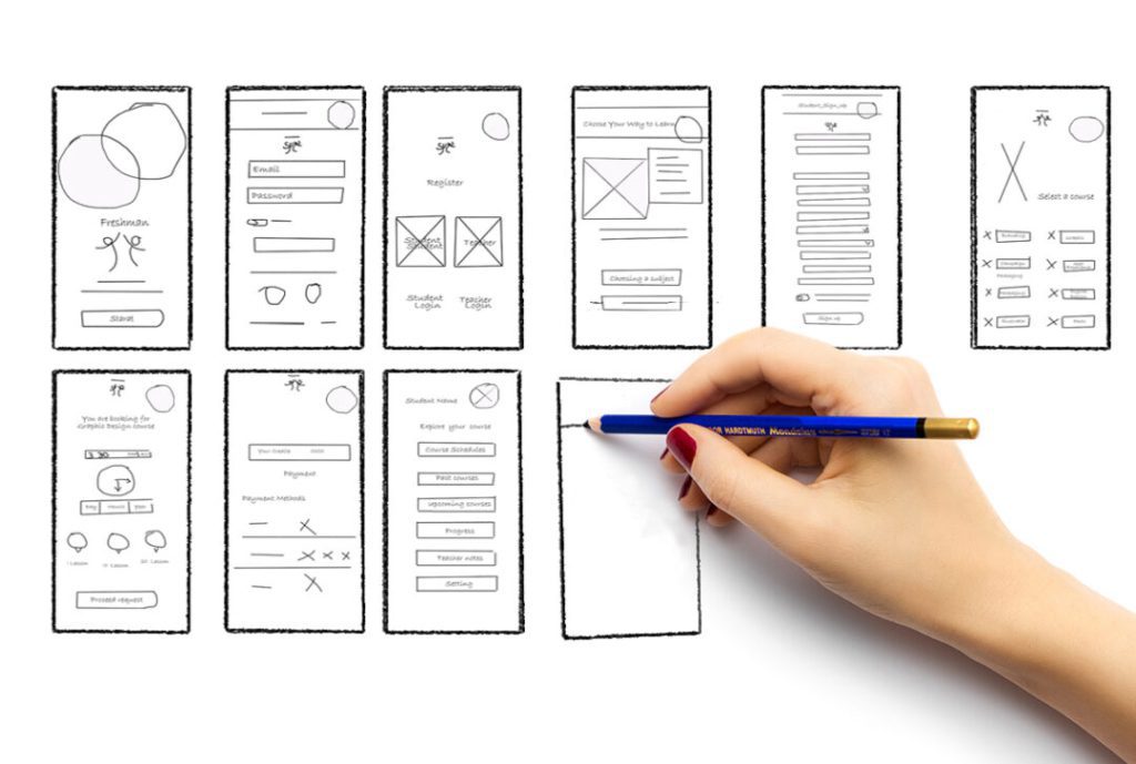
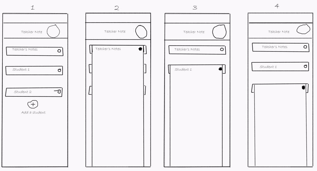
Sketches
I generally tend to get attached to a single idea while sketching, but for this project, I detached myself from a particular idea and worked on multiple layouts.
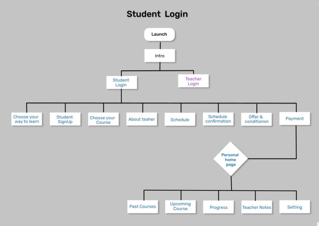
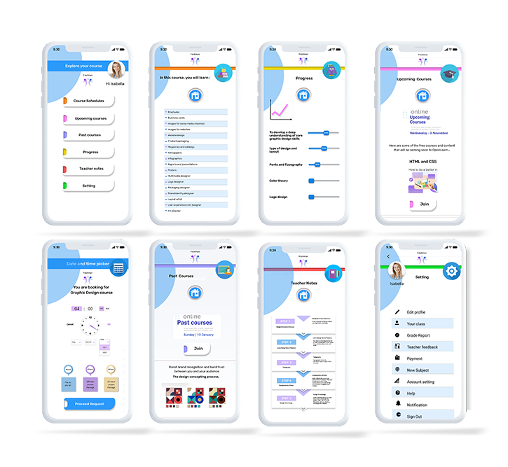
Student
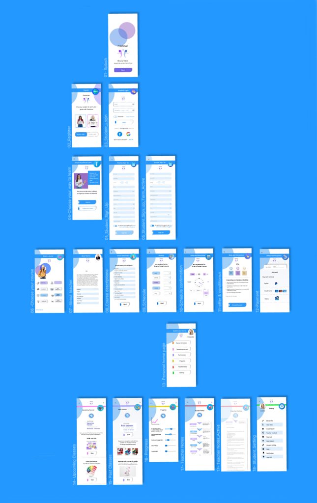
17 Screens
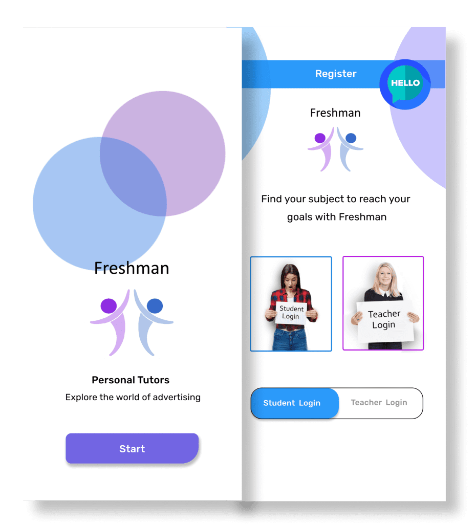
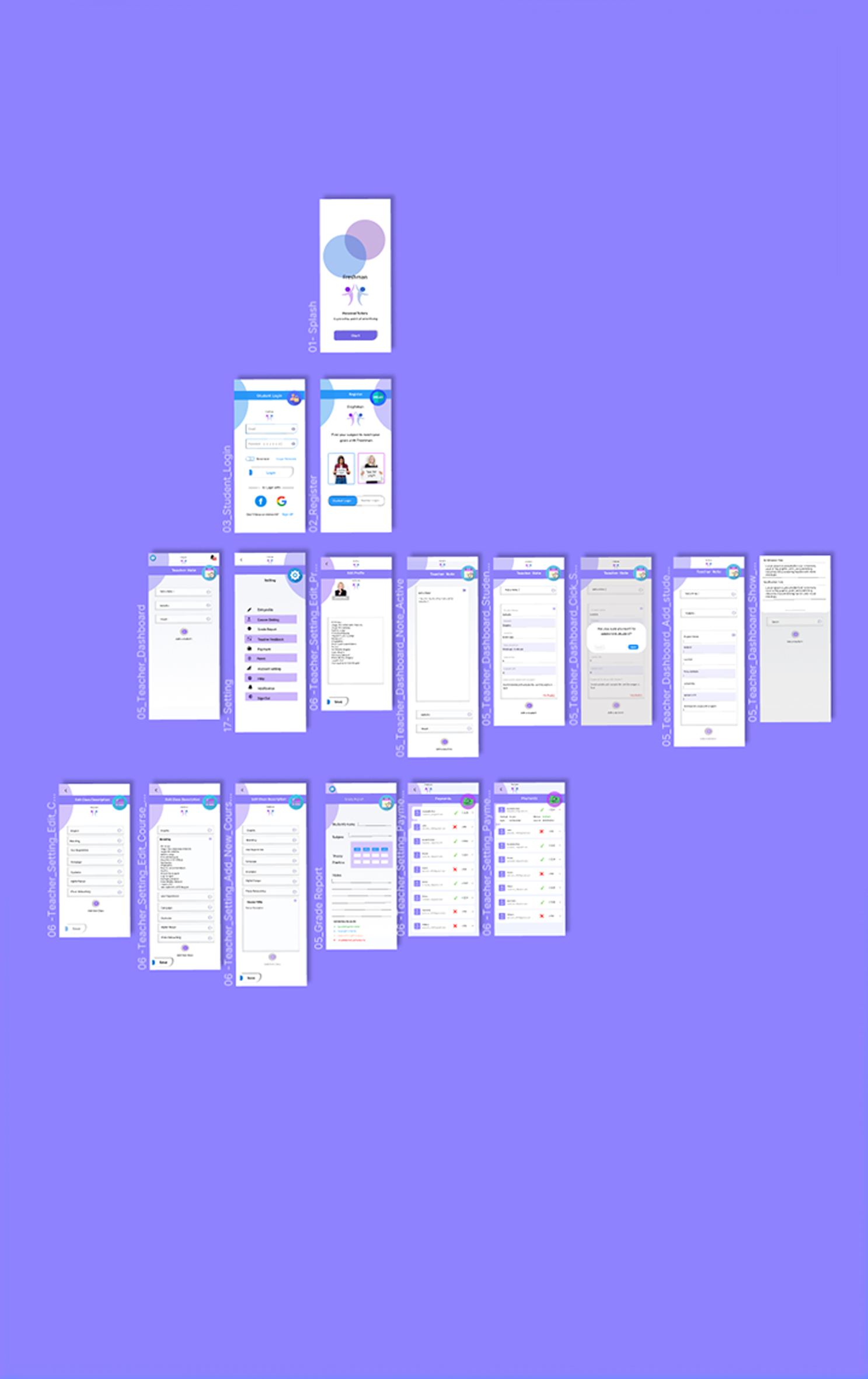
01-Splash
02-Intro
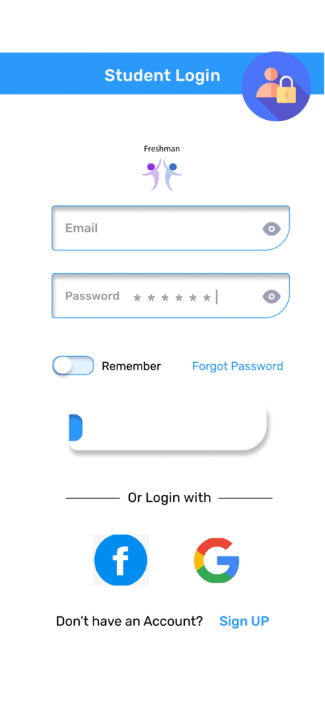
03-Student_Login
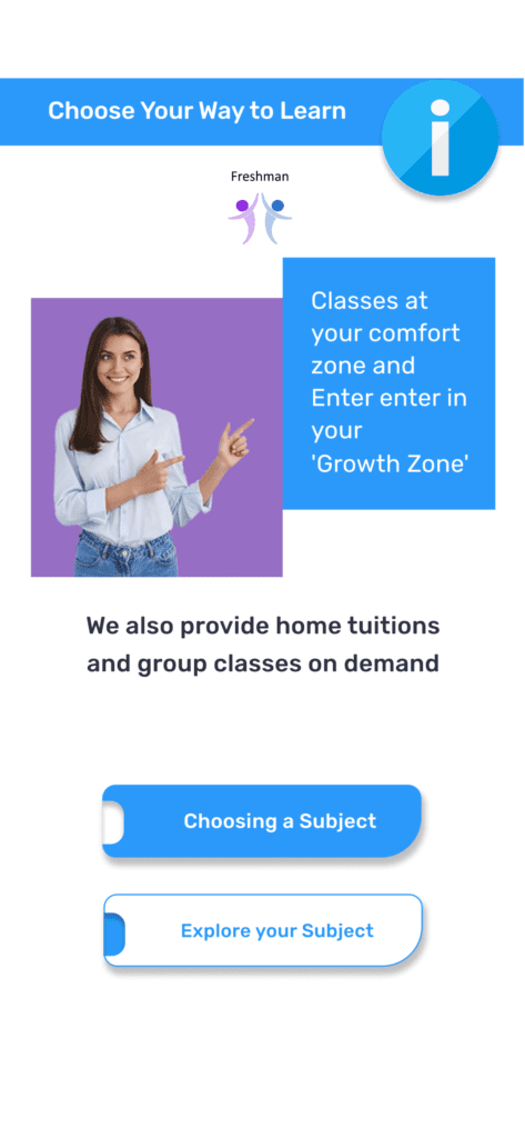
04-Choose your way to learn
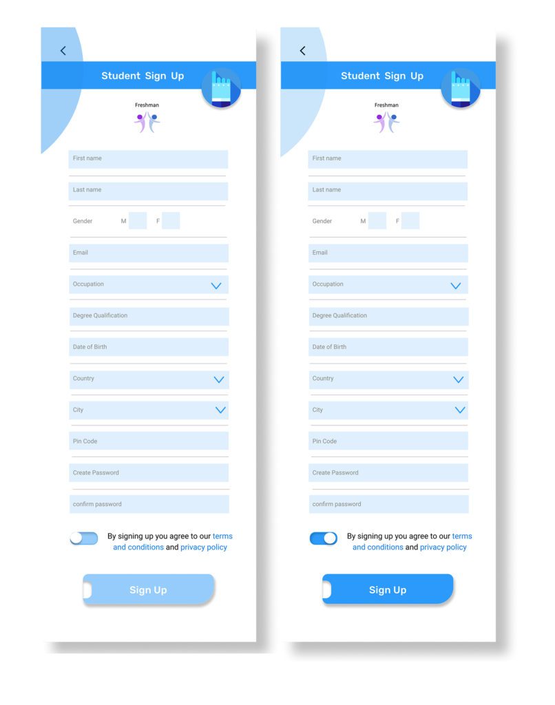
05-Student_Sign_Up
06- Choose your Course
07 -About teacher
08-Course descriptione
09-Schedule
10-Schedule confirmation
11-Promotional offer & terms and conditions
12-Payment
13 -Personal home page
14-Upcoming course
15-Past courses
16- Progress
17- Teacher Notes
18-setting
Visual Design
I didn’t like the feel of the old students app, Considering the app will be used by 17–25-year-olds it has to look and feel like that. So I came up with changing the product personality overall.
For the new product personality, I had three keywords in mind and I tried to stick to those while designing the visuals:
Modern
Clean
Smart
The first thing I wanted to change was the logo as it clearly didn’t follow the product personality.
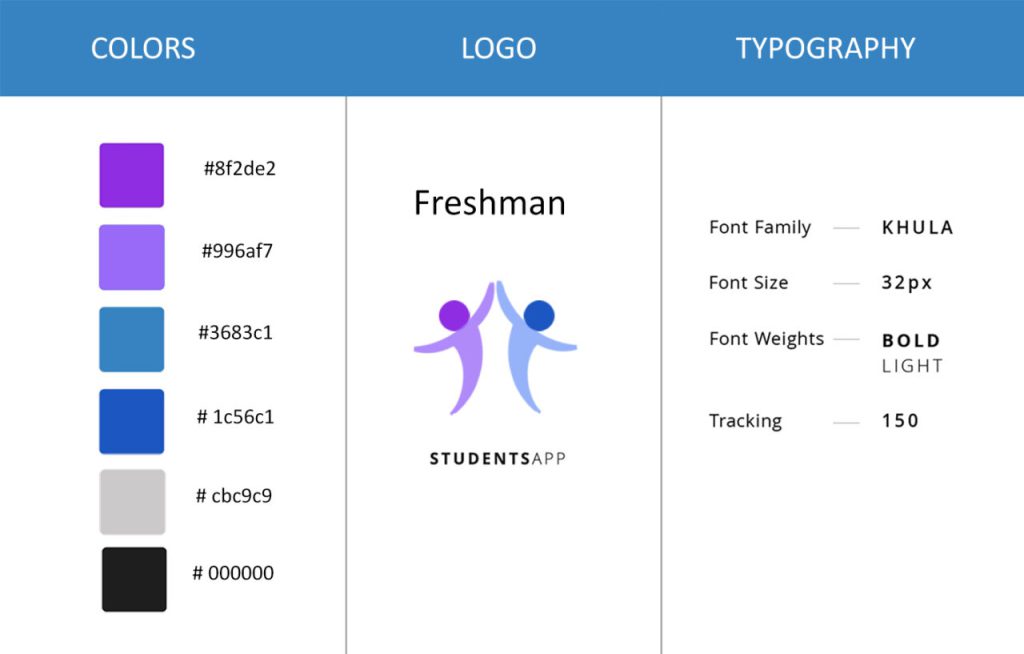
Color Palette
The color BLUE symbolizes confidence, intelligence, and purple is connected to power and wisdom, . Hence, a blue color palette is fitting for an app that promotes inspiration and motivation. Additionally, I used grey for the text and and included a great deal of white to give a calm and clean appearance.
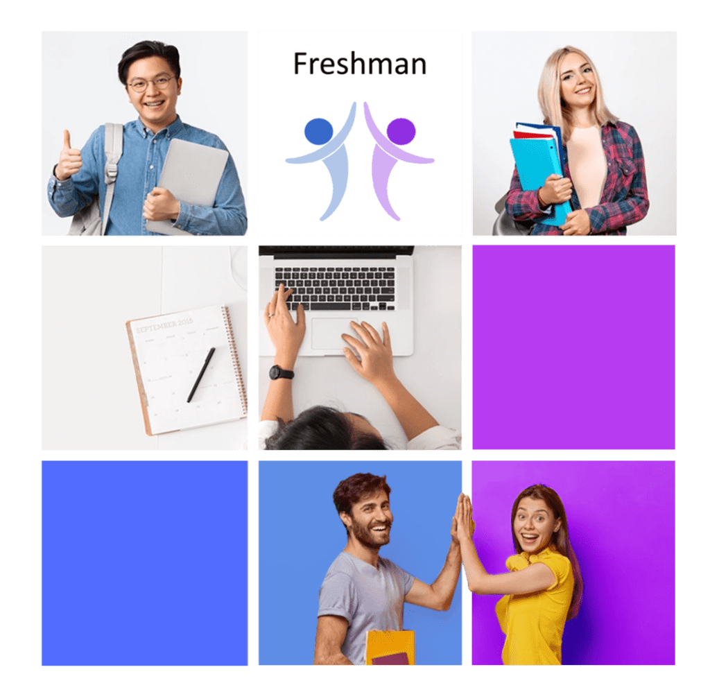
Naming & Logo
The main reason to choose the name Freshman learn at home was practicality. I wanted to have the word ‘at home’ in the name as I felt this suits the app’s vision and therefore I chose Freshman as a biginner and “Learn at home”.
I wanted the logo to be creative, reflecting the name itself. The logo looks like a teacher and student are high fiving because they reached their goal.
Moodboard
I built a Moodboard to inspire me, which would assist me in the decisions of choosing the typography, color, system grids, images, etc.
Once the Moodboard was done, I was able to create a visual identity system, where I laid those design decisions that I thought was relevant for users to feel familiar with the product.
Screen Explanation
Sign-Up and Sign-In
Home screen will be designed in such a way that is for both Teacher and Student.
Home Screen
The left menu bar is for student to login or fill-up the registration application form
Naming & Logo
Onboarding Screen
Student can choose to study with the Zoom app or in a group class before signing up.
There is also some information about course and knowing the tutor is before pickup The Subject.
Selecting a calendar Date and Time
There are terms and conditions as well before payments.
The student can choose their subject and some information about their teacher.
There is also some information about what they will learn in the course description.
The student can choose their level and select the time and availibility.
There are terms and conditions as well as offers just before payments.
Wireframes
This visual guide represents the skeletal framework of the app. It helped me arrange the interface elements while I focused on the functionality rather than what it looks like. Moreover, the simplicity of wireframes allows me to quickly test ideas without diving into the details.
Define
High Fidelity
Students Homepage
Teacher
12 Screens
01-Splash
02-Intro
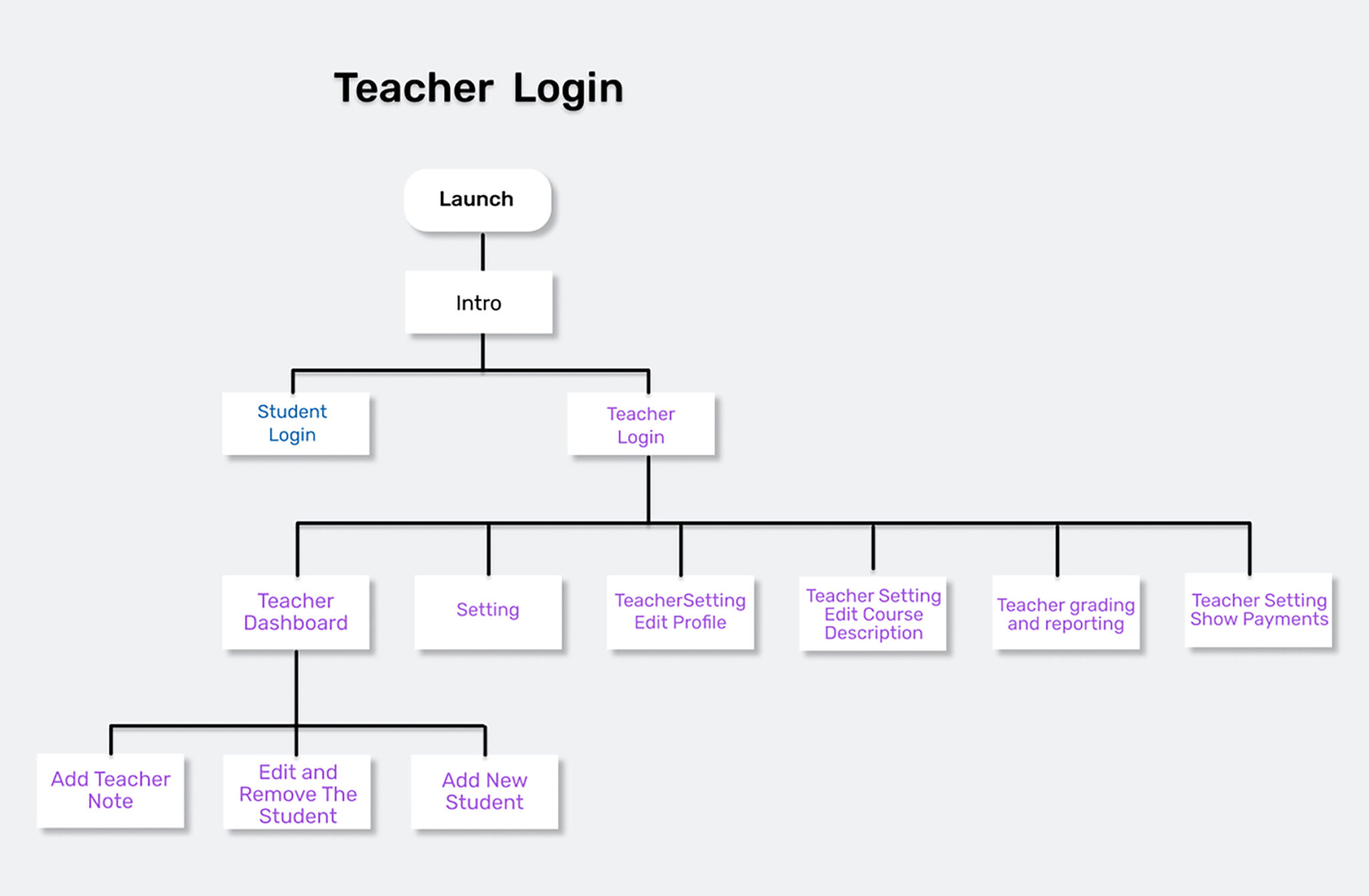
03-Teacher_Login
04-Teacher_Dashboard
10-Add Teacher Note
11- Edit and Remove The Student
12- Add new Student
05-Setting
06-TeacherSetting Edit Profile
07- Teacher Setting Edit Course Description
08 –Teacher grading and reporting
09-Teacher Setting Show Payments
Teacher after login can go to setting and
write notes,
add or delete students
put the grade report
Grade Card
Providing grading report will aid the parents asses their children, how they are in studies, what to improve.
Warning grade will provide information about the studies and what are more care is to be given.The graph screen will be designed in such a way that we would be able to understand what is the grade.
Chat Screen
Chat feature in this app helps students to interact with their tutor , clear their doubts even after their classes.
Future Iterations
After the user testing, I understood users are expecting some more features in the app. Since prototype is meant to be a minimum viable product (MVP), many features were excluded in the design. Below things will be taken into consideration.
Users can select their teacher from a list
Users can share their achievement in a social media platform sites like twitter, facebook, WhatsApp etc., which makes them proud and also it will be an unpaid promotion for our app.
Take Aways
Design is a solution to a problem.Art is a question to a problem. — John Maeda
This project improved my problem-solving skills, the idea nurtured further by thinking on the user perspective.
Refining and Redefining the product and user flow based on the usability testing will help the product to stay unique from competitors, repeat again from the ideation stage until the target user finds it as the featured solution
I’m delighted by the outcome of LEARN AT HOME and I firmly believe that this app will truly be a solution to the problem statement and will be accepted by the target user.
Special thanks to Neral for being a starting point for this project. Sarath Damodar and Joe Domenic for their support and also I need to thank people who took the time to tell me about their thoughts, pain-points, experience and test my prototype.