
My Supima
The Project
UX/UI Case Study
Duration: 2 weeks
The problem: Local E-commerce and how might we help users shop from a local e-commerce store.
Goal: Design an e-commerce website where the products are easily searched and have realistic information details.
Challenges: Time Management, Finding Users available for Interview.
Tools: Paper, PenFigma, Photoshop.
Context
The client we work with is an owner of a clothing store named My Supim. It is a small business driven by the client’s love for fashion and the environment. The store sells vintage and visually appealing clothing and most of the clothes sold is made from premium cotton.
This business’s goal is to sell high-quality clothing that can last a long time, which is why this business collects, repairs, and reworks products. Unlike other clothing stores, they want to supply clothing that customers would use for a longer time period.
At this point, many questions were raised:
Putting aside these questions for now, we tried to understand the customers first.
Emphasize & Discover
First, it is important to get to know and emphasize with your user. What are their goals and frustrations? Additionally, what other platforms exist and how does Episode differ from them?
The tools utilized in this stage were:
Brand Analysis
Since e-commerce websites are well-studied in the industry, we were instructed to spend most of our research time for benchmarking and market research. Aside from that, we put a focus on developing a sense of professional best practices and rules of thumb you can employ for creating a pleasant e-commerce experience.
The online shopping industry is booming in popularity and every brand opens online stores. With the increasing market expansion and saturation, there are countless potential customers. What are the strengths of online stores? Why are they so popular and in what ways are they better than offline stores?
COMPETITIVE ANALYSIS
A competitive analysis allows me to find out what features attract customers and should be re-evaluated for both the business and the customers.
Direct: Direct competitors are categorized as Online fast fashion.
Next, we compared the home screens of our competitors’ apps and the competitors are selected based on these 4 qualities:
The key findings were:
DEFINE
User persona
Since e-commerce is well-studied in the industry, we were instructed to spend our research time on benchmarking, market research and developing a sense of professional best practices and rules of thumb you can use for creating a pleasant e-commerce experience.

User Interviews
A competitive analysis allows me to find out what features attract customers and should be re-evaluated for both the business and the customers.
Direct: Direct competitors are categorized as Online fast fashion.
Next, we compared the home screens of our competitors’ apps and the competitors are selected based on these 4 qualities:
The key findings were:

Affinity Mapping
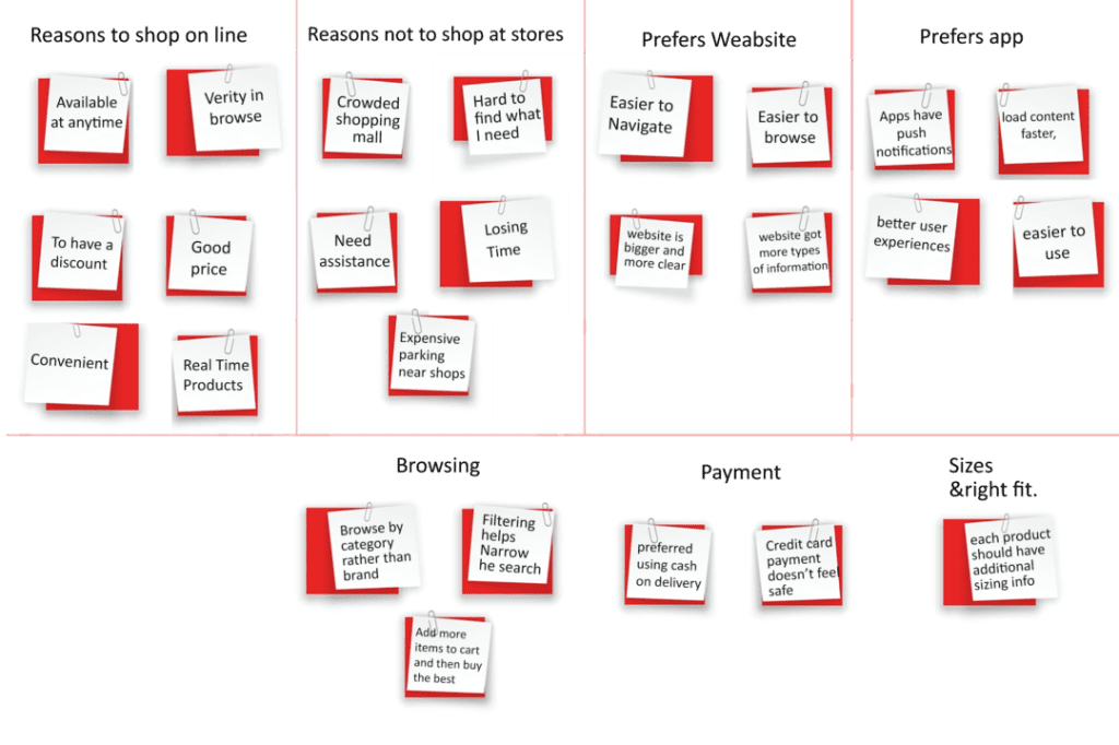
After conducting user interviews, we organized into groups in Affinity Maps. Using the map, we identified common habits, problems and pain points. This was a key process in designing our Magento e–commerce app.
Interview results
I discussed with 5 fashionistas and 2 professional people.
At this stage, I focussed on the purchase of an individual article and that will complement what the user already has in their closet (the persona has a budget and compares the prices of items). Some competitors give access to complete outfits, recommended but not on the immediacy. Competitors propose outfits “Box”, offer the user to create their own looks, or to appeal to a stylist. My personal shop considers the style of the user upstream. This allows it to propose new articles that match with his style and the pieces he owns.
After learning about the strategies businesses use and the users’ needs, I created one persona that represents the traits of the target audience.
Insights:
From interviewing 10 people, I learned that:
Most interviewees considered shopping a fun, therapeutic and entertaining experience but were not interested in fashion in a traditional sense, although they owned trendy pieces. They based their shopping on prices and their preferences
While every interviewee enjoys shopping, they were also interested in a more minimal wardrobe with better organization and outfit building.
The majority of interviewees planned their outfits in the evenings, some using outfit inspiration from websites like Pinterest and Instagram.
After pre-interviews with users, we defined a few main problems:
After pre-interviews with users
We defined a few main problems:
Users wanted to be able to check how the product looks like at different stages of the shopping path.
The product information on the product card was named differently in the shopping cart.
Users wanted to be able to check how the product looks like at different stages of the shopping path.
The product information on the product card was named differently to the ones in the shopping cart.
Users wanted to be able to check what the product looks like at different stages of shopping.
Users wanted to be able to check how the product looks like at different stages of the shopping path.
User persona
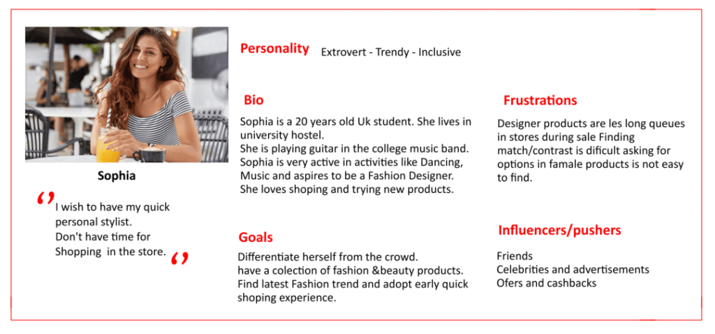
Based on previous research data, I developed a user persona as a representation of My Supima target audience.
For example, Sophia’s background serves as a guideline for future design solutions and processes.
User Flows
The app should allow the users to organize their wardrobes and build new outfits out of the pieces they own. By sharing outfit ideas with each other, we can change consumers’ ideas about fashion. Users can curate their own styles, as simple as curating their social media profiles. It will allow them to find fashion inspiration based on the items they already own. By connecting with others and forming a community, people keep each other motivated and inspired every day and guide each other along their journey to a more minimal and sustainable lifestyle with a reduced need for consumption.
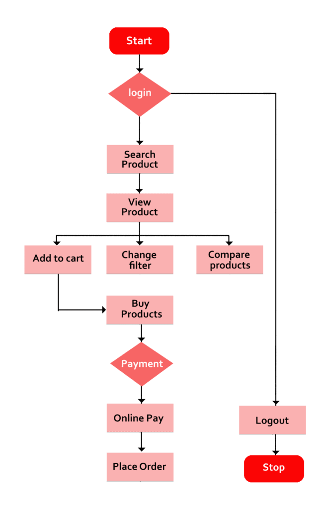
MAIN PROBLEMS THAT I NOTICED
PROPOSED SOLUTIONS:
Persona and user journey
I collected and analyzed research and usability testing findings before designing the e–commerce store.
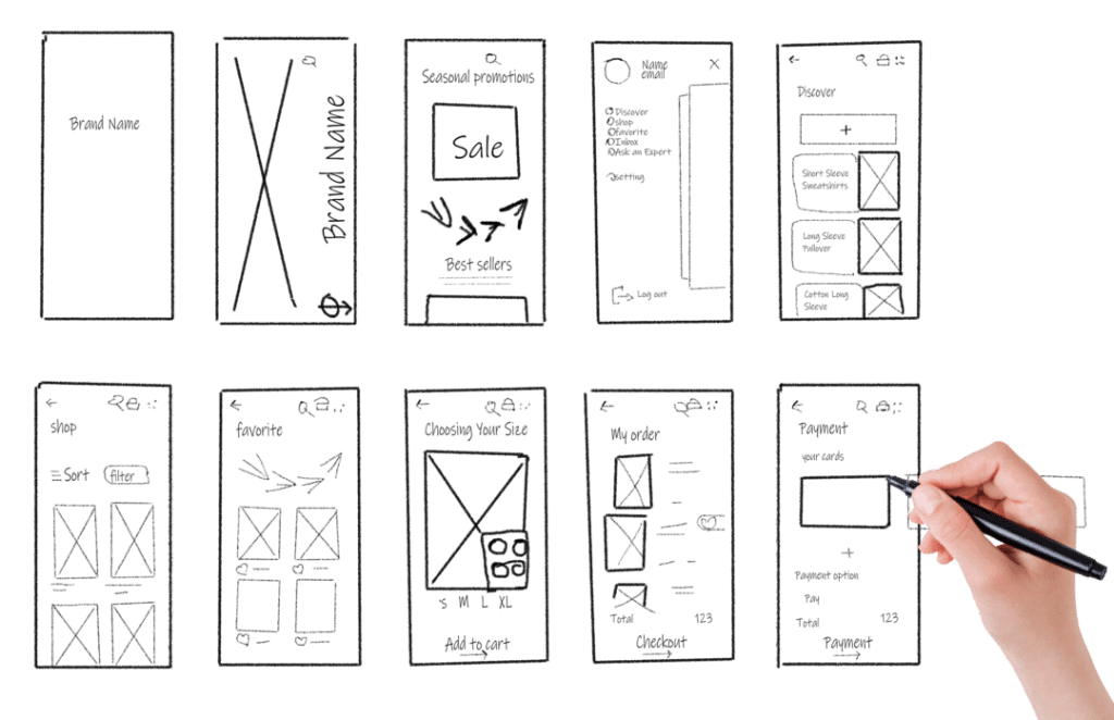
Then, I used both paper sketches and interactive prototypes to present and validate my design ideas.
The images below show wireframes I’ve created during the collaboration with My Supima.
I iterated the prototype after a round of user tests, which resulted in valuable discoveries I could use to improve the e-commerce UI and UX.

Design solution
I implemented a quick-view option that is simple and shows all the items’ images from the category page – so the users loved this feature.
User need: “Let’s say there’s a dress I like and I want to see more pictures or videos.”
User need
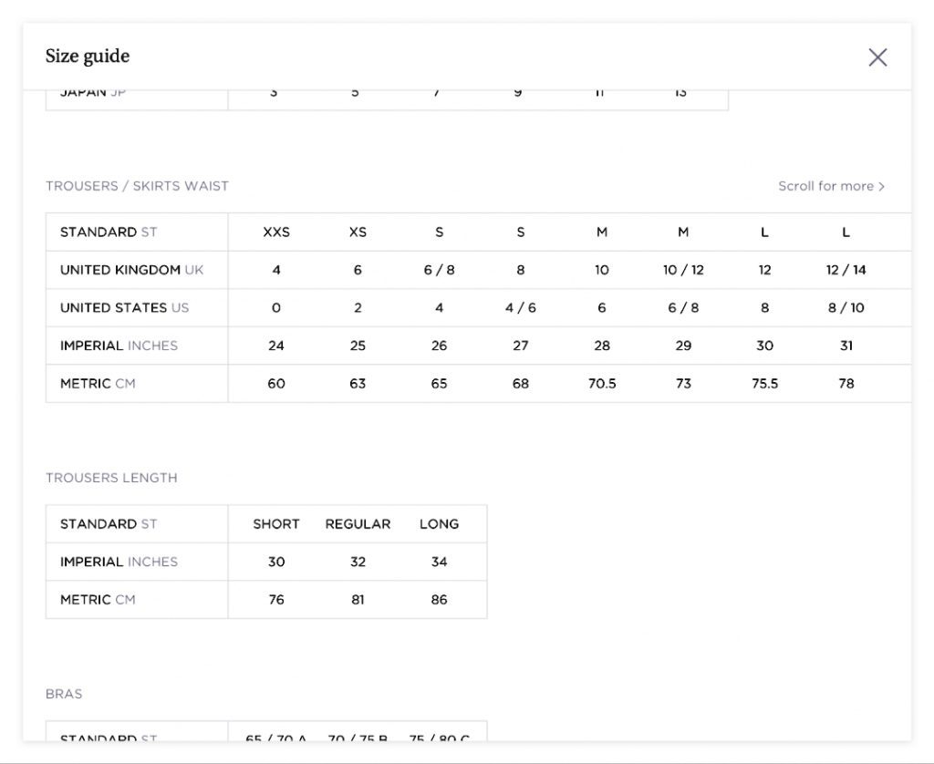
“How should I know what the right size for me is when the website does not have a proper size chart?”
Our design solution.
The UX studio team created an accurate, easy-to-use sizing guide that compares different sizes, including measurements in inches and centimeters.
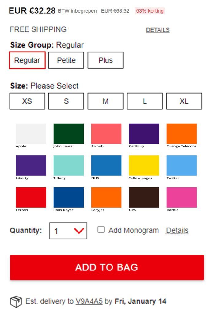
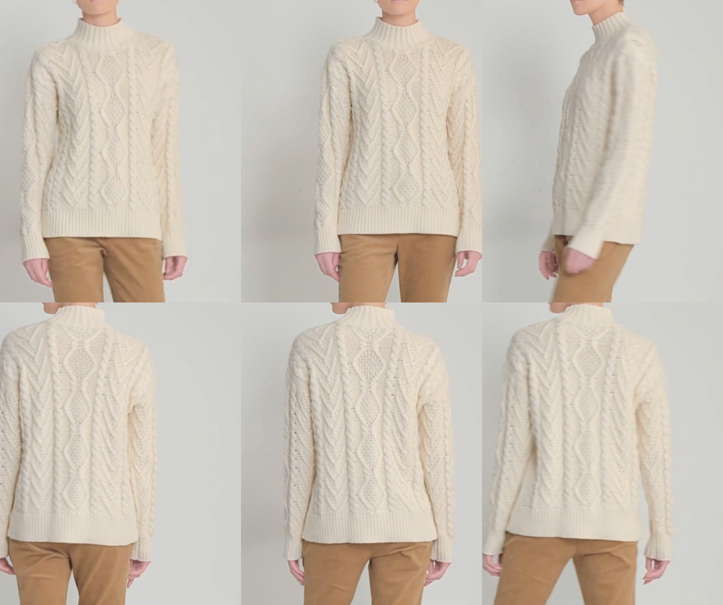
Once I had a ready list of error and the biggest priorities, we started to design solutions. Below we will present some of them:
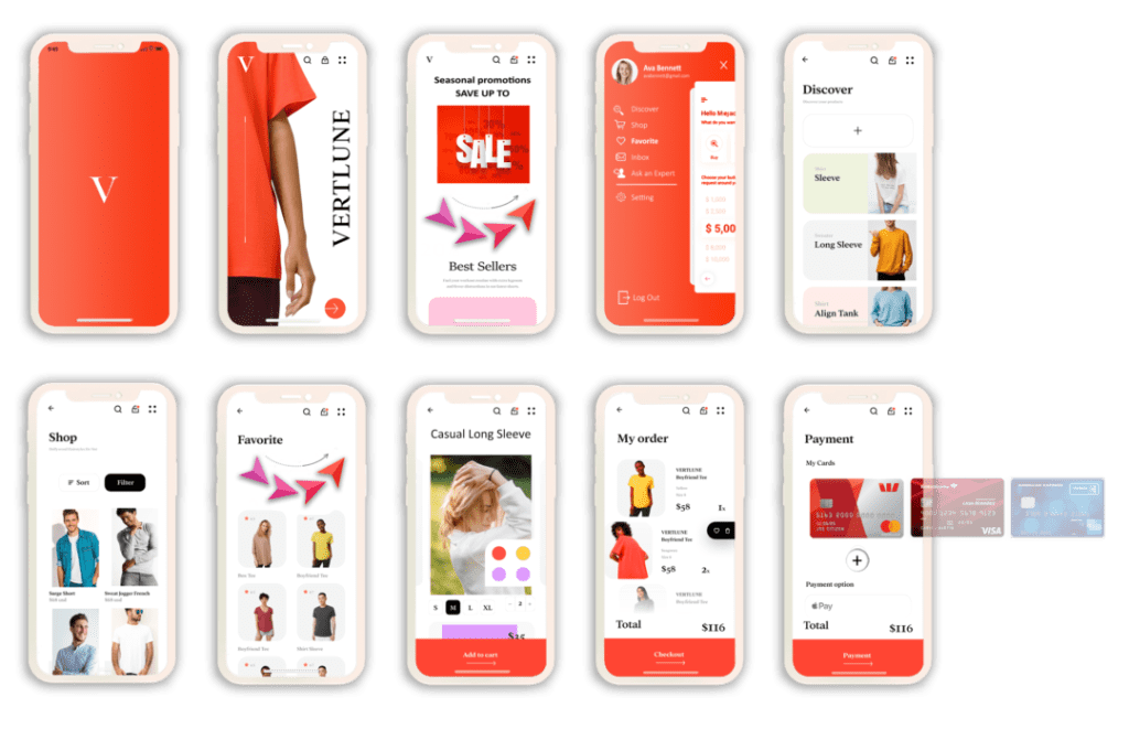
Conclusion and Reflections
Reflections
This was an extremely interesting project to work on. I resonated with the target persona’s dilemma, so it was interesting to talk to users and understand their different perspectives.
I discovered many intriguing insights and it felt easy to be distracted and get side tracked on any number of them. However, keeping focus on the project is very important to create meaningful impacts on the business.
Research is key
You can’t design a powerful e–commerce user experience without learning about the users’ needs and wants. User experience research is a crucial method to dive into their motivations and problems. This allows the team to create an e–commerce UI people will love to use.
Small things can make a huge difference
Changing the newsletter subscription popup’s position or adding a “secure checkout” label does not seem like significant improvements, but they help address users’ frustrations. If uncertain, A/B testing can help you reveal the best-performing layout.
Conclusion
For shopping enthusiasts to those hate the process, all users still seemed to want the same things from their experience — to shop with confidence.
The main challenge is to understand what problems users face when shopping for clothes and how we can use technology to deliver a pleasant shopping experience.

