
Happy Bowl
Web Design/ UI/UX Design for a meal kit
Duration: 2-weeks
Tools:
Pen and paper
Figma (High-fidelity prototypes)
Photoshop (Image editing)
Adobe After Effects
Elementor
The market for meal kits is made mostly of younger consumers that wants more from home mad and seeking out inspiration and assistance.
I took the role of both a UX and UI designer responsible for designing the experience including the aspects of usability, interaction, visual design, among others.

Introduction
Client
Happy Bowl is a meal kit delivery service. Their -friendly boxes contain locally sourced ingredients with recipes that must be cooked by customer using the pre-ordered menus included in the box. Every week, customers choose recipes and receive boxes (meal kits). Those contain all ingredients and instructions to cook the recipes. The goal of this project is to designing the mobile website with the users in mind.
The Goal
My goal was to design an accessible and inclusive mobile app that lets users order Ingradien from Happy Bowl quickly and easily at their own convenience.
Opportunity
Our evolving foodscape is an opportunity for us to explore and experience how to make healthy homemade food and be able to share these dynamic experiences with others.

THE PROCESS
The Problem
People are pressed for time and often struggle to make out time to cook or sit down for a nice meal around a table. As a User Experience designer, the challenge here was to find a unique solution that helps these people get healthy ingredient and recipes easily.
We believe that by making a product or service that allow millennial professionals to easily order ingredient and recipes, we would help them achieve their need of saving time and having the satisfaction of having healthy homemade food.
- The meal kits plan subscription flow lacks granularity and simplicity. It is for example impossible to order multiple times the same meal kits or review.
- There is not enough information about the people that ordering.
- It is not easy to share recipes with friends.
The Goal
The Problem
My goal was to design an accessible and inclusive mobile app that lets users order Ingradien from Happy Bowl quickly and easily at their own convenience.
Opportunity
Our evolving foodscape is an opportunity for us to explore and experience how to make healthy homemade food and be able to share these dynamic experiences with others.
RESEARCH
QUESTIONS
1- Does the Catchy Clothing brand align culturally with their target market?
2- Does their new 2018 fall clothing line meet the needs of their users?
Social Metrics
Instagram is Catchy ’s strongest marketing channel and is responsible for driving most of the traffic to their online store. After analyzing the site performance and the social engagement the data began to tell a deeper story. Users were engage with new promotional content and then converting to the online store. After browsing for a couple minutes they would leave the site. This led me to a few questions that I wanted to explore in user interviews.
Competitor analysis (Features)
I observed two (3) major players in the food delivery service, Blue Apron, Sun Basket, Home Chef, and Hello Fresh, compared their features, and identified which ones are essential for the mobile app.
We reviewed direct and indirect competitors for site navigation, content, and suppliers of the products. From this, we planned out the extra info to include in our site.
Notable features competitors developed
-
Ingredient Ratings
-
Ingredient Substitution Option
-
Delivery Flexibility
-
Wine Pairings
-
Recipe Origin Story
-
Community Tips
-
Listed Allergens
-
Required Utensil List
-
Built-in Cooking Timer
Understanding the audience
To know more about my target audience, I interviewed three (3) professionals who work in central business districts.
We talked for 30–45 minutes about their work and environment, eating habits, food preferences, among other things.
My key areas of inquiry are:
- Understanding the user.
- Understanding why the user prefers food delivery.
- Which method the user prefers when subscribing to food delivery.
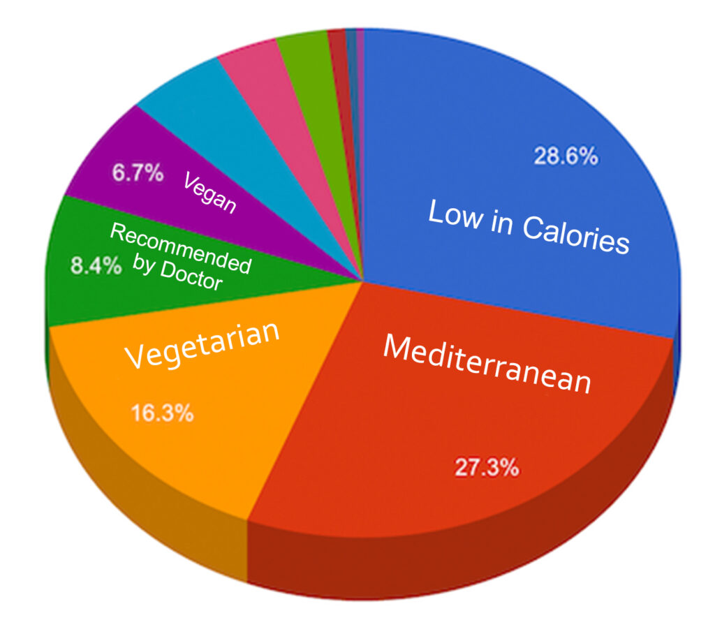
- Understanding the user’s food preferences.
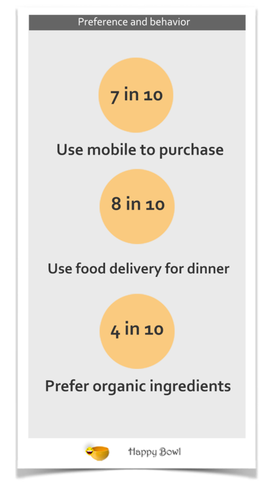
- Understanding the user’s purchasing habits, tendencies, and behavior.
- Identifying the challenges the user face and how they are dealt with.
Preference and behaviour
I also learned that the majority of my participants use to order food delivery on Saturday afternoon.
These shoppers also tend to have high incomes and high levels of education. Mainly single people.
Challenges to consider when building a food delivery app
The main challenge food delivery startups typically face is the need to efficiently balance the operations between all of the involved parties
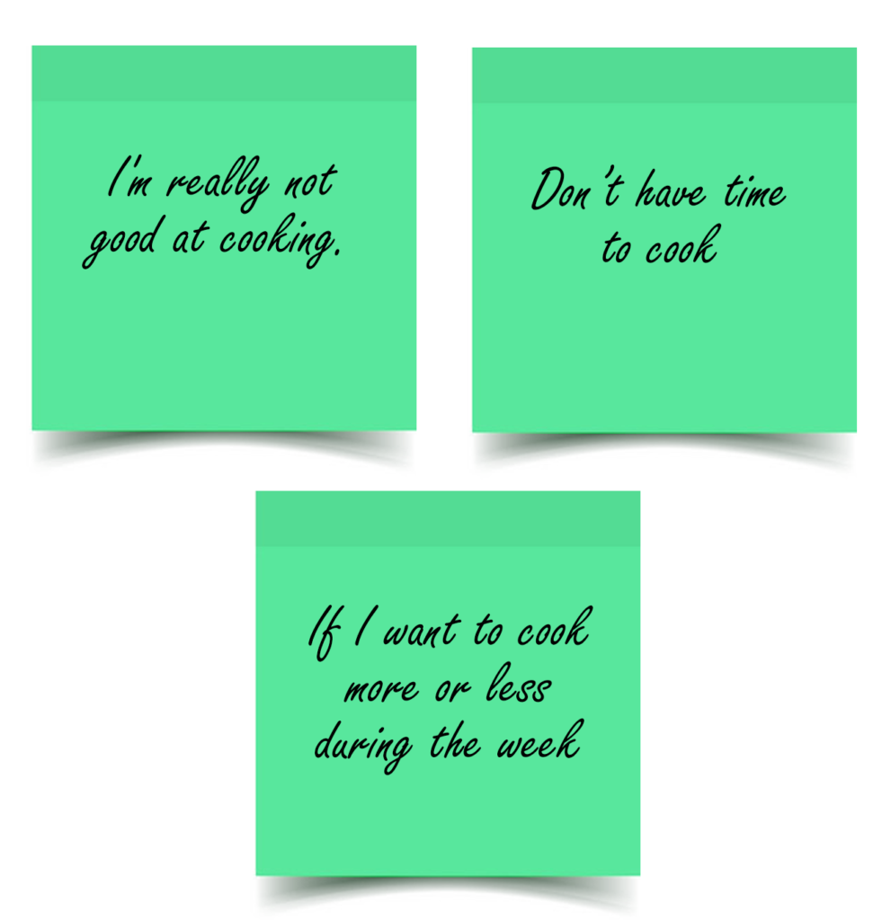
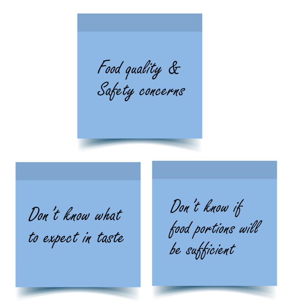
Affinity mapping
I also learned that the majority of my participants use to order food delivery on Saturday afternoon.
These shoppers also tend to have high incomes and high levels of education. Mainly single people.
Challenges to consider when building a food delivery app
The main challenge food delivery startups typically face is the need to efficiently balance the operations between all of the involved parties
Personal level issues
Food quality concerns

USER FLOW
PERSONA
User Interviews
Although I frequently use food delivery apps, I did not want my opinions alone to influence the resultant product, therefore interviews were done to widen my perspective.
The interviewees were asked a series of questions based on their experiences with major food delivery apps to learn more about their eating habits and their issues when using these apps. Questions were asked to learn about the following:
- How did they start to order food online and how often do they order food.
- Why do you want to use the food kit
- Their experience ordering food from popular apps
- How they order food using these apps
- The quality of food they received
- How do they discover various food and on what basis do they select a restaurant.
- Any issues they faced while ordering
Bio Jenny loves to eat good and healthy. She loves being able to sit and talk and eat with her family and friends around a table. She believes that good food can bring people together people together.

Goals
- Quick dinner ideas for when she don’t know what to cook
- Eat healthy and don’t gain weight
- looking for easy but impressive recipes
Frustrations
- Planning a meal takes time
- Shopping takes time
- Adding variety to her diet

Bio Jenny loves to eat good and healthy. She loves being able to sit and talk and eat with her family and friends around a table. She believes that good food can bring people together people together.
Goals
- Quick dinner ideas for when she don’t know what to cook
- Eat healthy and don’t gain weight
- looking for easy but impressive recipes
Frustrations
- Planning a meal takes time
- Shopping takes time
- Adding variety to her diet
Goals
- Quick dinner ideas for when she don’t know what to cook
- Eat healthy and don’t gain weight
- looking for easy but impressive recipes
Frustrations
- Planning a meal takes time
- Shopping takes time
- Adding variety to her diet
Summary
- Most who have used a meal delivery service in the past started because of a coupon or other incentive.
- Most tried the service but no longer use it.
- Incentives do not work to keep customers. Just offer the best service at a decent price to begin with.
- People like variety and the flexibility to choose according to their diet needs/restrictions.
- Those interviewed said they would subscribe to such a service if it was more cost effective.
- Quality of ingredients was of high importance.
- Counting calories and keeping track of macros was especially important to the success of keeping a healthy diet.
PERSONA
Prototype
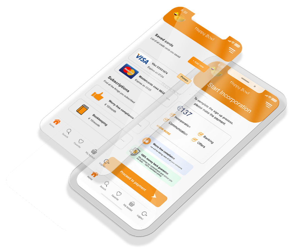
- After completing the necessary screens in preparation for the usability study, they are now ready for prototyping. I put my rough ideas to flesh out and better visualize how they would look as I create the user interface (UI).
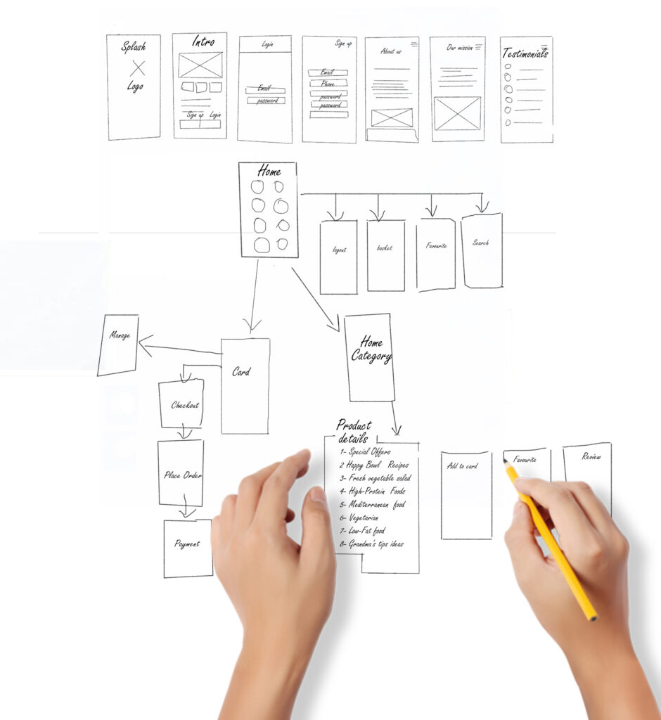
Medium-fidelity wireframes
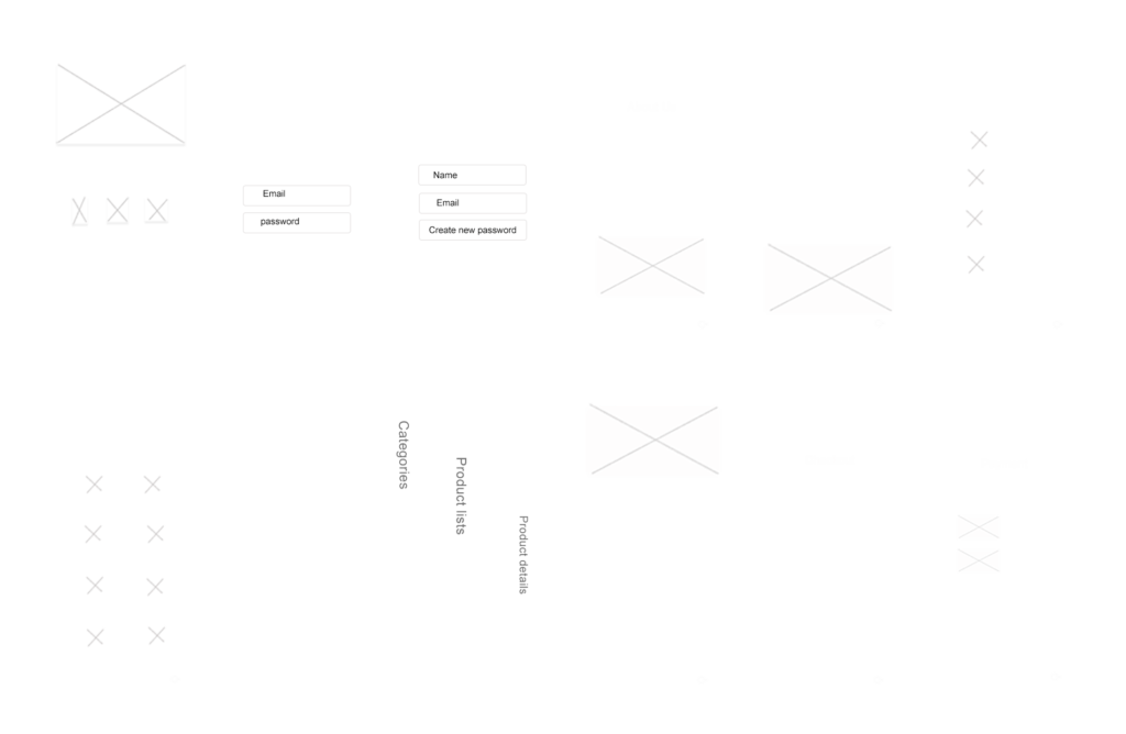
Since I already have the sketches, I went straight to designing the medium-fidelity wireframes. Usually, I do low-fidelity wireframes first if not because of time constraints of this case study.
Annotations
Putting annotations is important to understand the reason behind different design elements. For this instance, the annotations below basically explain how the design should behave.
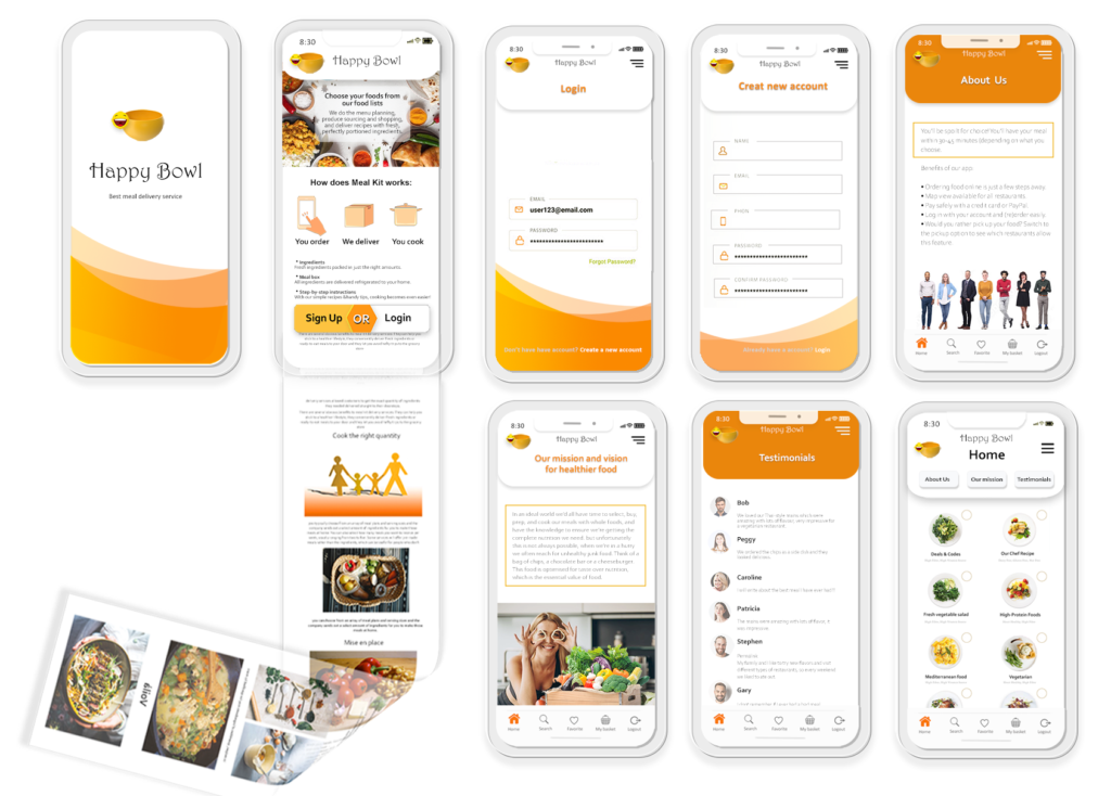
High Fidelity Prototype The high fidelity mockups you see here. These are just a few sample
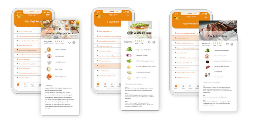
Accessibility & inclusion considerations
- I used sufficiently contrasting colours to ensure that the app’s content can be read by everyone.
- I used images with descriptive text, appropriate hierarchy & emphasis to aid users with screen readers.
- I used images and easily recognizable icons across the design to provide visual context.

USABILITY TEST
Our Mid-Fi prototype helped us make five usability tests via Google Meet Channel (as we still are struggling having face to face meetings due to Covid).
From these tests, we could gather several user feedbacks :
User A prefers to have information on products one by one and choose what he/she wants.
User B is telling us that it is not easy if you want to make your own recipe,
User C is asking: Why you don’t add recipe videos to your app?
These feedbacks helped us refine our solution in order to support the user flow and eliminate general pain points.
Take aways
It’s been a really interesting journey to work on this project. Even if it has been very disappointing to see Happy Bowl stopped after one year.
I am very grateful for all the things I learned.
Recruiting, preparing, and running in-person usability tests was also very insightful. It really allowed me to deliver a more refined design solution.
